Driving UX Impact for Scalable V2X Systems
Problem
U.S. roadways are becoming increasingly congested and dangerous, driving an urgent need for real-time, innovative traffic solutions.
Objective
Lead the development and scaling of a Connected Vehicle (CV) platform, ensuring that the design provided traffic operators with intuitive, real-time insights to improve decision-making and enhance public safety.
Team Role
Lead a small product design team as the functional department head, collaborating closely with other department heads to strategically execute short and long-term OKRs.
Users
Key users included State Department of Transportation (DOT) traffic operators, technical hardware experts, roadside hardware installers, and operations and maintenance personnel.
Outcome
Scaled the design of the platform and expanded the product's marketable value, achieving sustained, measurable success in key UX KPIs through remote and in-person user testing (80+ SUS and 3.5+ CES).
I.
Scaling connected vehicle solutions to solve roadway challenges
United States roadways are increasingly congested and dangerous. In 2021, over 6 million traffic incidents resulted in 38,000 fatalities, with drivers wasting 97 hours annually due to congestion—costing individuals approximately $1,350 each. This growing issue creates an urgent need for smarter, real-time solutions.
Connected Vehicle (CV) technology presents a promising answer by transforming vehicle data into meaningful roadway insights that enable real-time traffic monitoring and management. Key benefits include:
- Provides real-time snapshots of road conditions, identifying potential hazards like icy roads or imminent congestion based on sudden braking patterns.
- Enhances traffic flow and safety by allowing State Departments of Transportation (DOTs) to respond to incidents more effectively.
- Reduces congestion and travel times through quicker, data-driven decision-making.
This project focused on developing and scaling a production-grade CV platform that helps traffic operators leverage connected vehicle data to significantly enhance traffic flow, improve public safety, and contribute to global transportation solutions.
Previous project context
Previously, I had worked as the founding product designer to successfully launch the product into a new market by designing viable MVP, with live product demonstrations, which secured a major contract within 7 months.
II.
Transition to senior design leadership
After the initial MVP launch, I transitioned from an individual contributor to a Senior Manager of Product Design. In this role, I served as both a player-coach—balancing hands-on design contributions (20%) and strategic leadership (80%)—to guide the vision for the CV platform and lead multiple design initiatives while ensuring alignment with broader business objectives.
Key project objectives
- Support platform scalability: Scale the CV platform design to deliver value across multiple product verticals to various user groups.
- Enhance usability and impact: Drive measurable design outcomes that improve system usability, leading to faster decision-making by traffic operators, and aligning with broader safety and efficiency goals.
- Lead design strategy and team growth: Lead the design team to create consistent, scalable solutions through strategic design, fostering a high-performance design culture.
III.
Cultivating a unique design team culture
In our engineering-driven environment, cultivating a distinct design culture was essential. We prioritized creativity, collaboration, and user-centric principles while advocating for UX best practices across the product development lifecycle. Our structure leveraged individual strengths, balancing data-driven decisions with creative exploration. I worked to build a culture of open dialogue, constructive feedback, and innovation, ensuring alignment across all teams.
Aligning design work with business objectives through OKRs
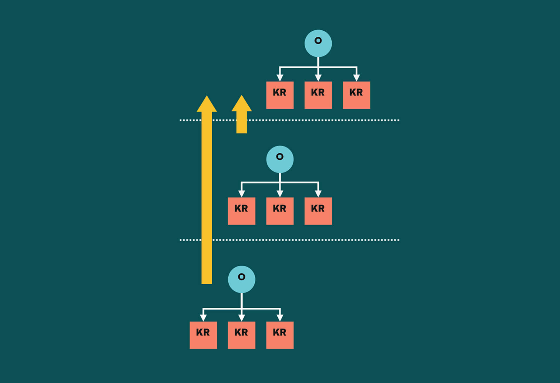
To ensure our design efforts aligned with broader business goals, I introduced OKRs (Objectives and Key Results) for both the design team and individual members each quarter. These OKRs were directly traceable to high-level business objectives, which I helped shape alongside senior leadership. This provided clear direction, enabling team members to see how their work contributed to overall product success.
Building career pathways for team success
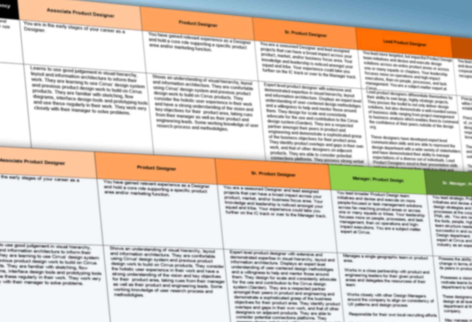
To support each designer's growth, I developed a two-track career ladder for both individual contributors and leadership roles. This provided transparency around potential career paths and helped align personal aspirations with team and company goals.
Creating a culture of open communication and growth
In our design team, I prioritized transparent communication and individual growth to foster a high-performing culture. The following initiatives were central to achieving this:
- Radical Candor: Used an approach that combines personal care with direct challenges, fostering open, honest feedback across the team.
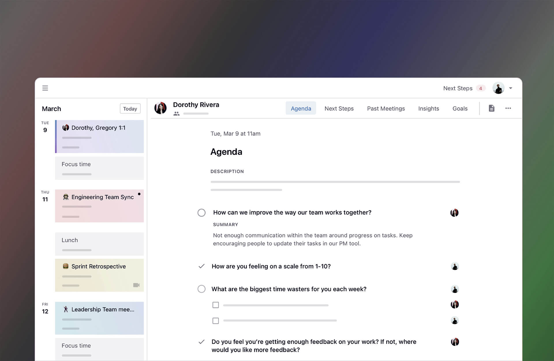
- 1:1 Meetings: Regular open sessions ensured alignment with OKRs while discussing career growth, aspirations, and challenges.
IV.
Improving team efficiency and cross-functional alignment
Problem: As the product matured, maintaining efficient collaboration and cohesive alignment across cross-functional teams became a growing challenge. Disjointed processes and inconsistent communication hampered productivity and slowed down progress, especially across Design, Product, and Development teams.
- Inefficiency in collaboration due to inadequate systems for prioritizing discussions and adjustments before sprint commitments.
- Lack of consistent communication between Product, Design, and Development, leading to delays and misalignment.
Challenges:
Goal: Establish structured, proactive methods to foster better communication, increase sprint velocity, and improve alignment across cross-functional teams, ensuring timely, efficient progress from design to development.
V.
Streamlining team dynamics with product huddles and agile practices
With the sudden shift to a 100% remote environment due to COVID-19, existing disjointed processes became even more challenging. There was already confusion about what was being built, when, and why, but remote work amplified these issues, making effective collaboration harder. We needed a new approach to not only bring design, engineering, and product teams together for alignment but also to enhance workflow efficiency and team velocity despite the challenges of this new remote reality.
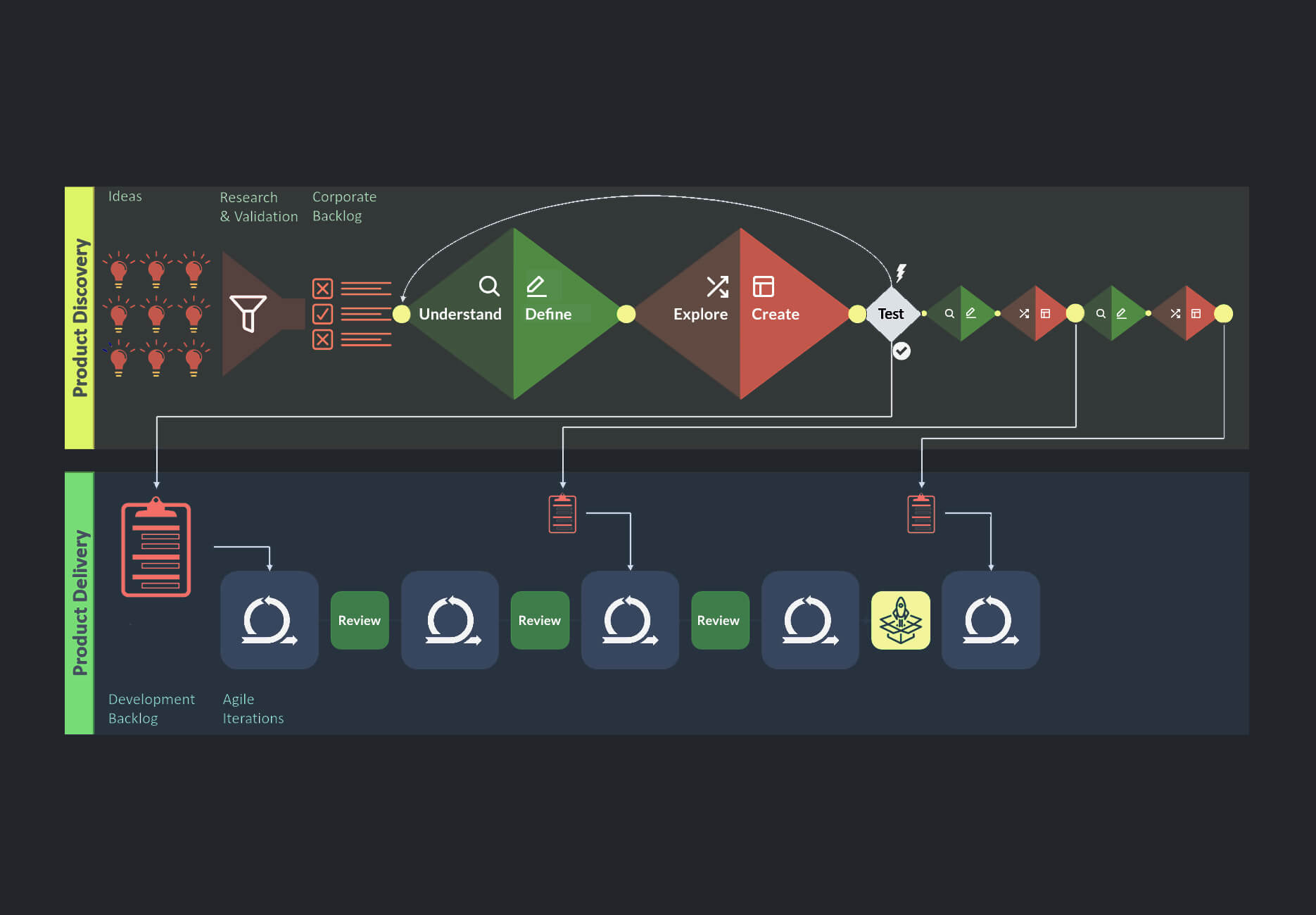
Dual-track agile for improved planning and execution
Initially, all work—including design and development—were essentially planned together, leading to a reactive workflow that constrained the design process. Tasks were executed too close together, leaving minimal time for planning, iteration, and user testing.
- Positioning design work 2-3 sprints ahead of development, allowing space to explore, iterate, and validate before engineering execution.
- Create earlier opportunities for collaboration with developers during solution engineering discussions, ensuring clarity and alignment before tasks were sized and moved into development.
I advocated for formalizing dual-track agile to enable a proactive approach in order to:
This restructuring established a clearer, more predictable workflow and increased the overall quality of our design solutions.
Cultivating 'Product Huddles' for team synergy
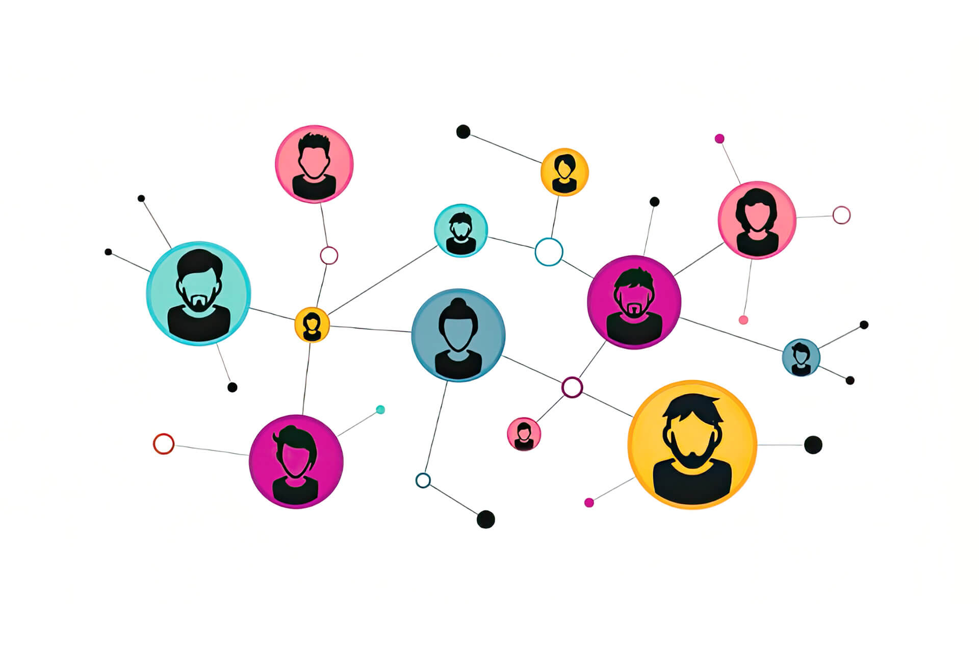
To tackle the collaboration issues amplified by the shift to remote work, I launched a Product Huddle initiative. Similar to a 'Design Crit,' these structured, interactive meetings brought together design, product, engineering, user research, and data science teams to align around key initiatives.
- Structured discussions for alignment: Each huddle centered on features and epics being developed, as well as the insights from user research or user testing sessions that informed our design decisions.
- Refining the process for greater impact: Feedback-led iterations helped evolve the huddles into a critical alignment tool, driving consistent improvements in productivity and alignment, as shown by satisfaction survey results.
Interactive spaces for real-time engagement
Led by designers and approved by product owners, each huddle involved workflow updates and interactive activities, including live sticky notes, comments, and feedback sessions. These meetings fostered an inclusive environment, improving alignment towards a common goal. These huddles also connected cross-functional team members as directions and dependencies emerged, such as a data engineer to front-end engineer.
Result: Increased alignment and sprint velocity
The use of dual-track agile and product huddles brought much-needed clarity and efficiency to our workflows, directly resulting in:
- Boosted productivity and sprint velocity by 25%: Allowed the team to deliver features faster and iterate more effectively, ultimately meeting tight deadlines with improved quality.
- Cross-functional alignment: Enhanced alignment across design, product, engineering, reserach, and data science teams, supporting the platform's scalability and ensuring consistent value delivery across different user groups.
VI.
Scaling design strategy amid ambiguity
While fostering a strong design culture and building effective product huddles, I faced the challenge of scaling our strategic design efforts across multiple product verticals—all while navigating new customer requirements in a brand new connected vehicle market. Managing these intertwined dynamics required effective planning, collaboration, and constant adaptation.
- Balancing consistency and flexibility: Maintaining a cohesive design strategy while adapting to the unique requirements of each product.
- Measuring design success: Figuring out how to objectively demonstrate the value of the product design function and its impact on broader outcomes.
- Hitting strategic business goals: Ensuring the design process aligns with quarterly OKRs and consistently delivers high-quality, user-centered solutions.
Challenges:
Goal: Develop a comprehensive design strategy, and vision, across multiple product verticals, balancing flexibility with consistency to meet diverse user needs. Lead the team to deliver impactful, user-centered solutions while achieving measurable success and aligning with strategic business objectives.
VII.
Scaling with modular strategy and unified design
As the CV platform expanded, it became clear that a one-size-fits-all solution couldn't meet the diverse needs of DOT users. Through in-person interviews and contextual inquiries at DOTs—followed by affinity mapping sessions led by the research team—we uncovered a key insight that helped shape the overall product strategy and approach.
Insight: Diverse roles demand flexible workflows
Traffic operators, analysts, and technical teams work on very different kinds of tasks related to V2X technologies and have distinct workflows for similar tasks based on their roles. A monolithic system couldn't effectively address these varying needs, prompting a shift to a modular design approach.
Transforming product strategy with modular design
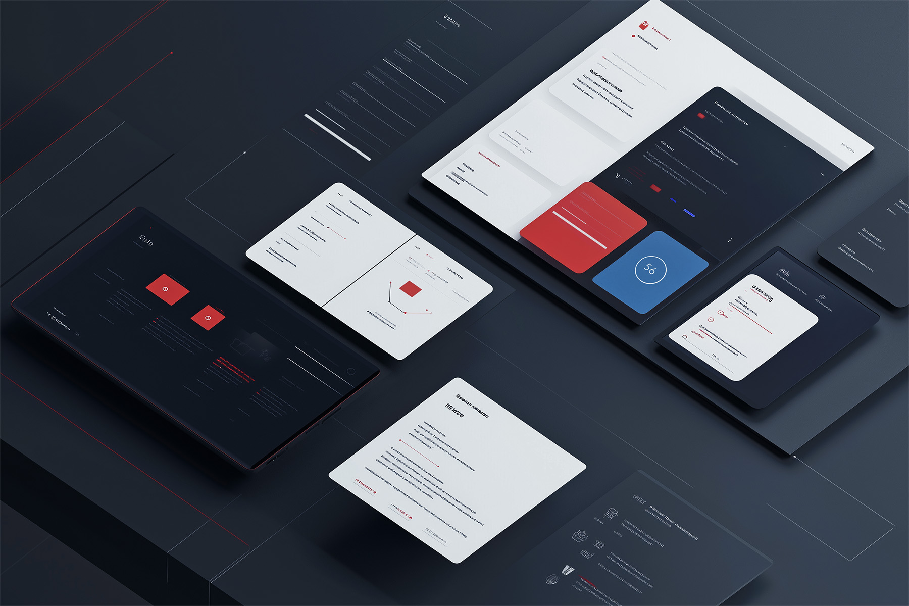
To create a scalable platform that met diverse user needs and supported long-term product growth, I proposed a modular framework that reimagined the CV platform as a flexible ecosystem of product verticals. I created a detailed presentation for senior leadership, demonstrating how this shift in product design strategy would align with long-term business goals while addressing key user needs.
Building the design system
To support modularity and maintain a cohesive user experience, I led the development of the Cirrus Design System. In order to develop this I took steps to:
- Secure cross-departmental support: Collaborated with product and engineering leads to position the design system as an essential investment. Highlighted its future ROI in reducing tech debt, improving efficiency, and ensuring long-term scalability.
- Manage design operations and procurement: Spearheaded the evaluation and integration of tools and services to establish an end-to-end pipeline for governance, maintenance, and implementation.
Shaping a bold, new design direction
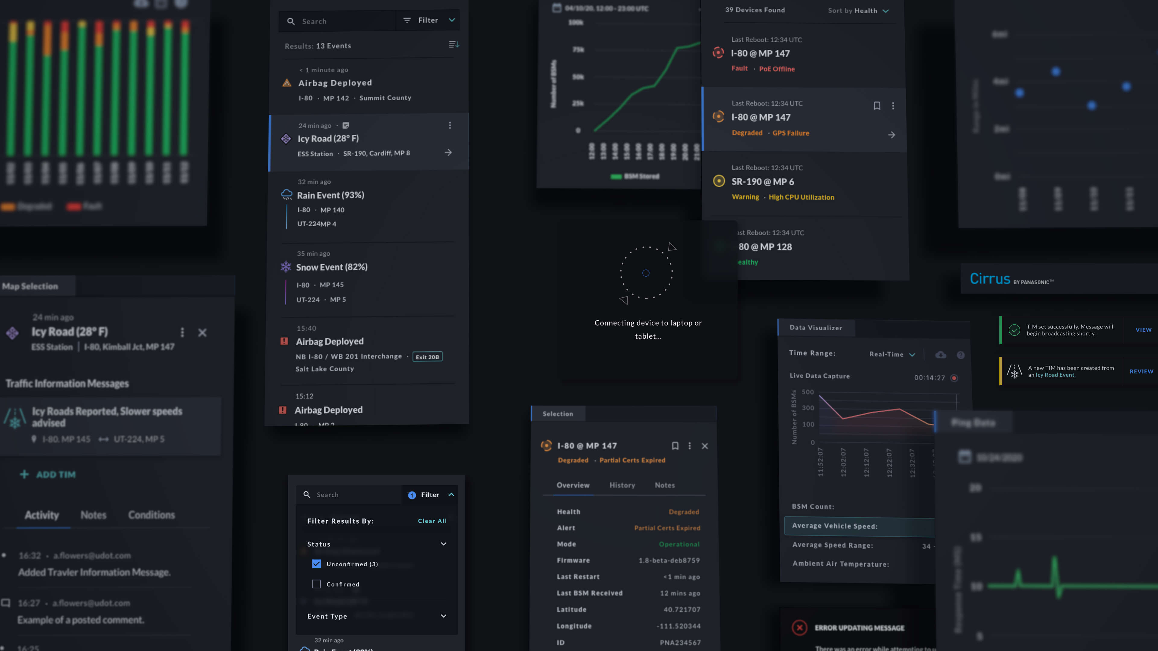
The Cirrus Design System introduced a forward-thinking aesthetic tailored to the demands of Panasonic's emerging software offerings. Designed to support complex, data-rich workflows, the system balanced innovation with usability, creating a scalable foundation for future products.
- Dark theme for clarity and focus: Based on user insights from firsthand observations of operators working in dimly lit environments, the dark-themed interface was designed to reduce eye strain and enhance visual clarity during extended use.
- Unified design for modular scalability: The cohesive color palette and reusable components ensured visual consistency across product verticals, reinforcing a unified identity while supporting the modular framework.
Result: 90% CSAT scores
Internal and external surveys revealed a 90% CSAT score, highlighting user satisfaction with the Cirrus Design System's visual design and functionality. This feedback validated our focus on aligning aesthetics with usability to meet diverse user needs.
VIII.
Defining success: Establishing a UX KPI framework
Building on the need to ensure consistent design impact across expanding product verticals, I developed a KPI framework that allowed us to measure usability and satisfaction effectively. This framework became the foundation for tracking and validating design success with both internal and external user groups.
Solution: Developing a Data-Driven KPI Framework
- Customer Effort Score (CES): Focused on task-level effort to evaluate workflow intuitiveness.
- System Usability Scale (SUS): Measured overall usability during prototyping phases.
- Customer Satisfaction Score (CSAT): Captured general satisfaction with the product experience. This approach allowed us to iteratively refine designs and demonstrate measurable improvements across user groups.
RTS: Elevating design for V2X connectivity
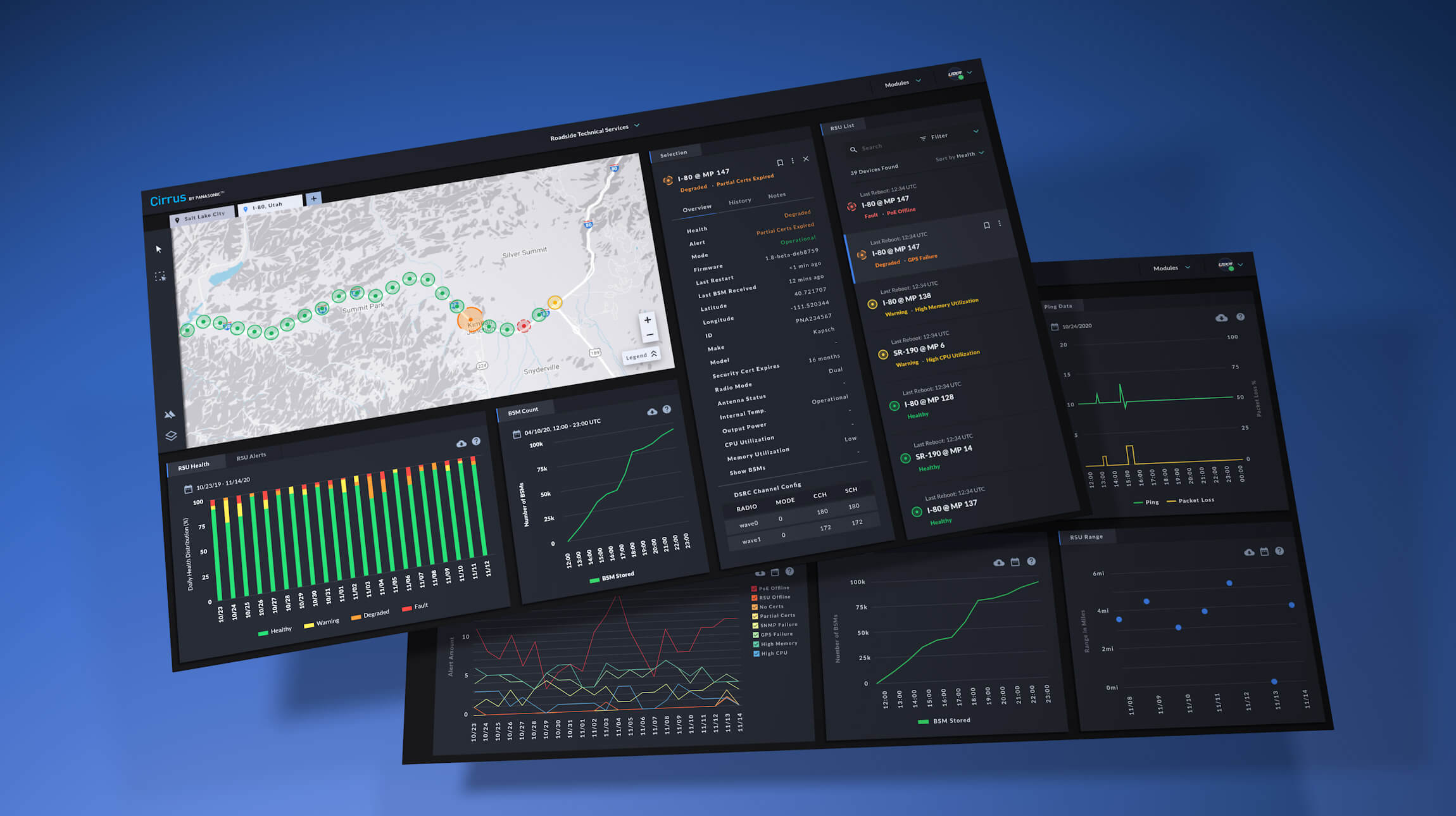
Cirrus Roadside Traffic Solutions (RTS) was key to successfully making roads 'connected' for traffic operators. It handled the deployment and upkeep of roadside hardware that allows cars with CV/V2X technology to communicate to the cloud infrastructure, as well as for opeartors to communiate back out to vehicles.
- By balancing usability feedback from internal O&M team members and other external, technical DOT users, the design team created some well-received product features and workflows that made V2X deployments much easier to manage and faster to act on.
RTS Metrics: Strong outcomes through monthly testing
In collaboration with user research, we regularly collected feedback and metrics from both internal, and external, users in technical roles, well-versed in CV technology. The key takeaway from this data was that our KPIs consistently measured well, often scoring above average, indicating the strong performance and impact of the RTS product.
These charts are approximations simply meant to convey how design success was tracked and measuredSimplifying insights for faster decision-making
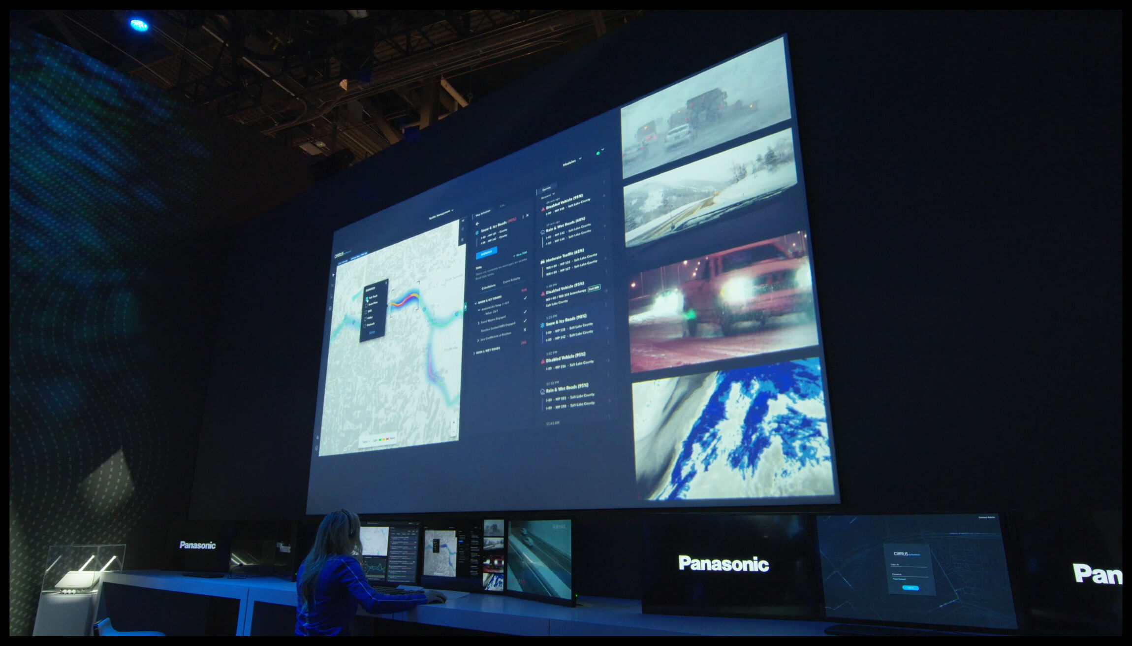
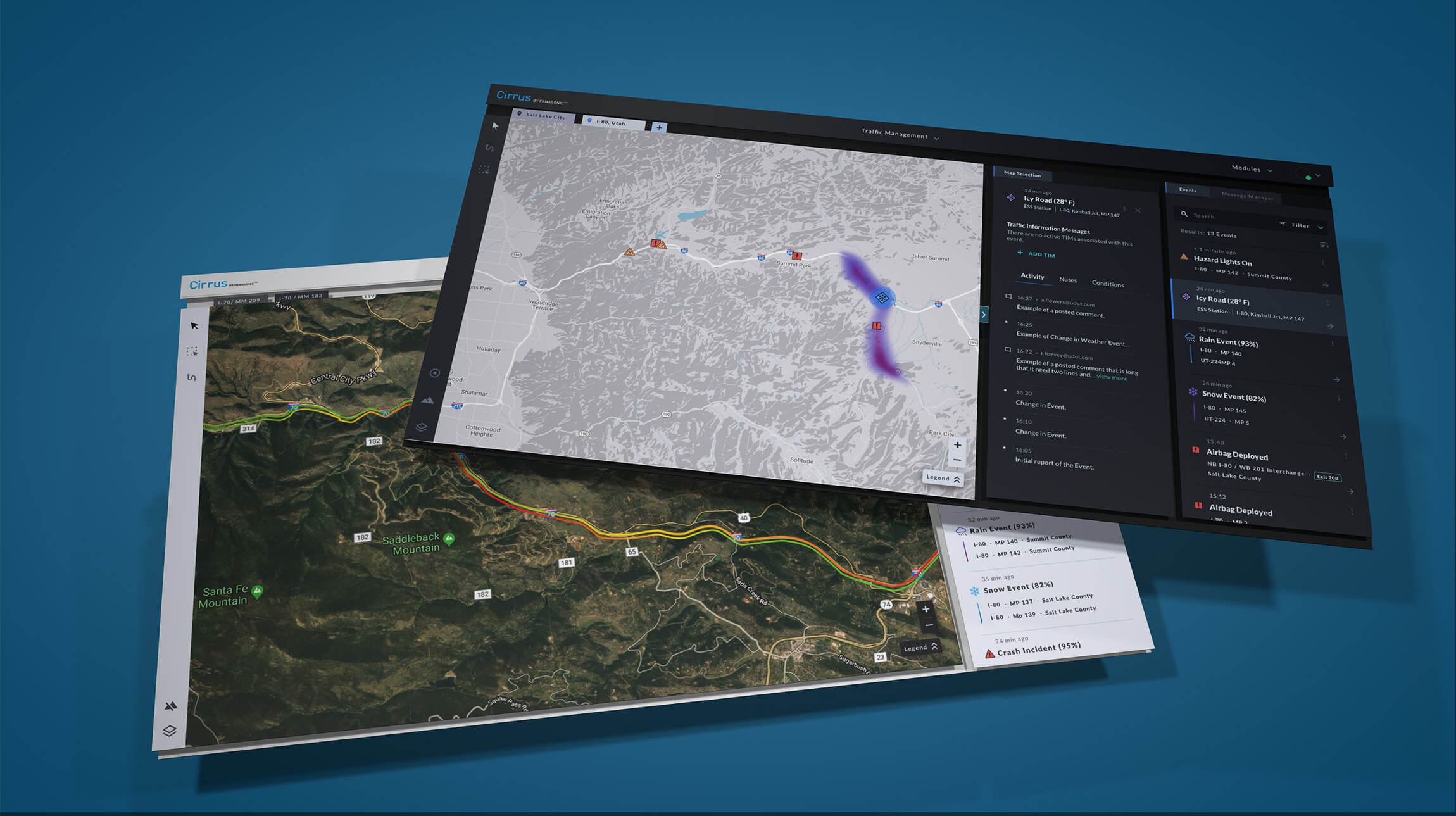
Cirrus Traffic Management harnessed CV/V2X data to provide state DOT traffic operators with real-time insights, empowering them to make faster, more informed decisions during roadway incidents. Unlike RTS, this product was designed for non-technical users, prioritizing clarity and accessibility over technical complexity.
- Targeting non-technical users: Recognizing that traffic operators often lacked deep knowledge of how V2X systems worked, the design focused on surfacing actionable V2X roadway insights quickly, and simply. This ensured operators could quickly understand and respond to critical incidents without additional technical training.
- Regular usability testing: Low and high-fidelity prototypes were tested with active traffic operators monthly to ensure workflows and features made sense.
TM Metrics: Iterating to improve usability
Initial feedback from external traffic operators revealed challenges rooted in unfamiliarity with the platform, how insights were presented, and the broader capabilities of V2X technology. These challenges highlighted opportunities to improve both the design and user education.
By engaging directly with operators through interviews and discussions every month, we refined workflows and data presentation to better align with user expectations and their mental models. Over time, KPIs on key workflows slowly rose to indicate more intuitive solutions.
These charts are approximations simply meant to convey how design success was tracked and measuredXI.
Conclusion & Impact
The Cirrus design initiative tackled one of the most pressing challenges in modern transportation—improving roadway safety and reducing congestion—by creating scalable, user-centered solutions that aligned with long-term strategic goals. Each phase of the project built on the previous, creating a holistic narrative of growth, innovation, and measurable success.
Tying the pieces together
- Scaling the platform across vertical needs: By identifying diverse user workflows and rethinking product structure, the modular design strategy allowed the platform to expand into a suite of interoperable solutions. This strategy not only addressed immediate user needs but also positioned Cirrus for long-term growth in the connected vehicle market.
- Measuring success through design KPIs: The development of a KPI framework ensured that the design team could validate their impact with data. Metrics such as CES and CSAT not only highlighted usability improvements but also showcased the critical value of the design function within a highly technical environment.
- Fostering a unified vision across teams: Initiatives like the Cirrus Design System and product huddles bridged the gap between departments, establishing alignment and operational efficiency across engineering, product, and design.
X.
Leading Cirrus creative direction at
CES 2020
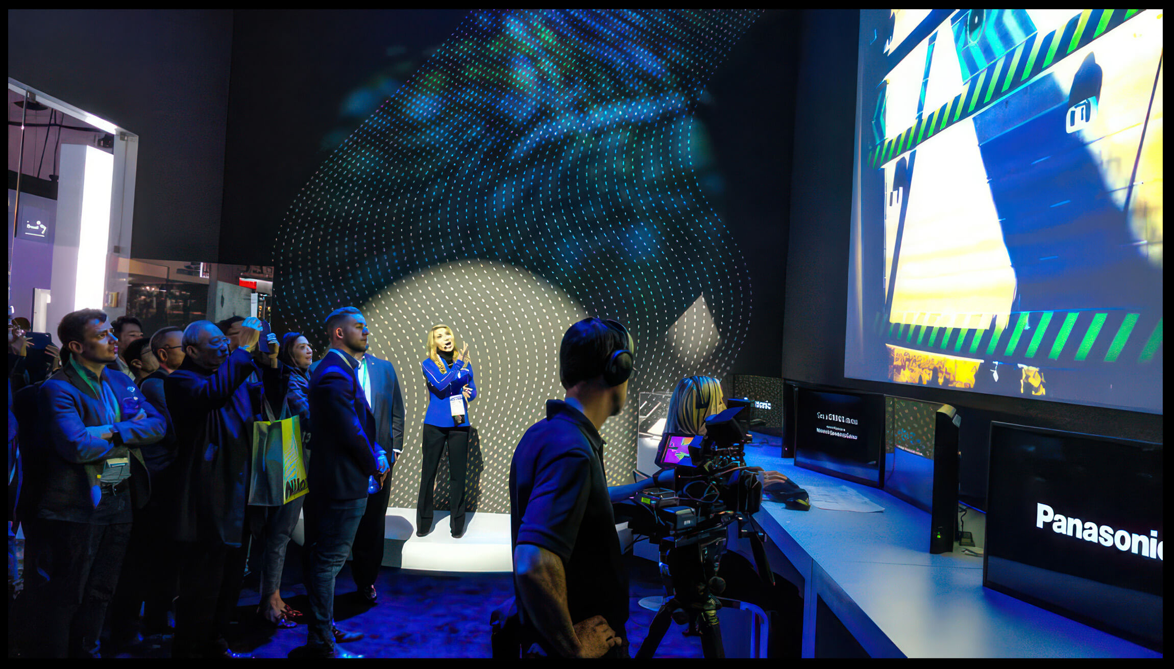
In the second half of 2019, I had the privilege of leading the creative direction for Panasonic's Cirrus showcase at the 2020 Consumer Electronics Show (CES) in Las Vegas, the world's largest and most influential technology event for groundbreaking innovations.
Collaborating with an external marketing and creative agency, I helped shape the concept, narrative, and creative assets over 4–5 months of preparation. The vision was to create an immersive experience that placed the audience inside a traffic operations center, offering a firsthand look at how V2X technology and the Cirrus platform could revolutionize modern traffic management.
During pre-production, I worked closely with production crews and stage actors to refine the experience and prepare for the event's ~15-minute live demonstrations, conducted more than 60 times over three days.

Cirrus by Panasonic won CES 2020 Innovation Awards Honoree Recognition in the Vehicle Intelligence & Transportation category and also received widespread global attention and publicity during the event.
XI.
Retrospective
My time working on the Cirrus project in a management role was as rewarding as it was challenging. I got the chance to learn from many of my more experienced peers how to be successful leader and manager. I experienced many new firsts in my career and learned many new skills and metholodologies around strategic planning, leadership, and people management.
Looking back at the 4.5 years I spent at Panasonic, I'm grateful I got to work with so many brilliant, hard-working, caring people. Seeing all of our hard work come together over the years, starting from ground zero, was definitely the highlight in my career thus far.
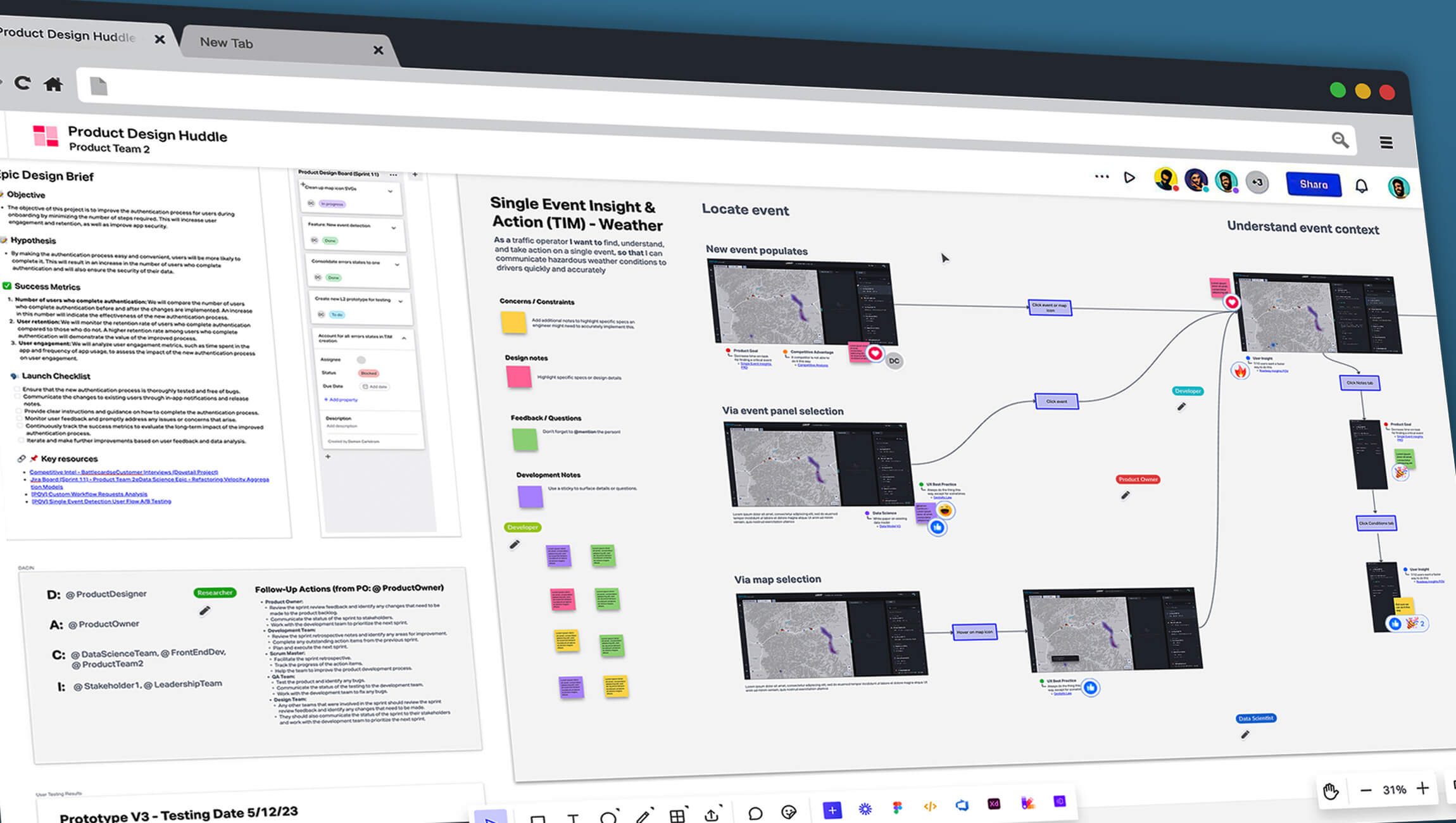 Huddle boards could include:
key research insights, design workflows/logic, user testing results, product briefs, data
science models used, etc.
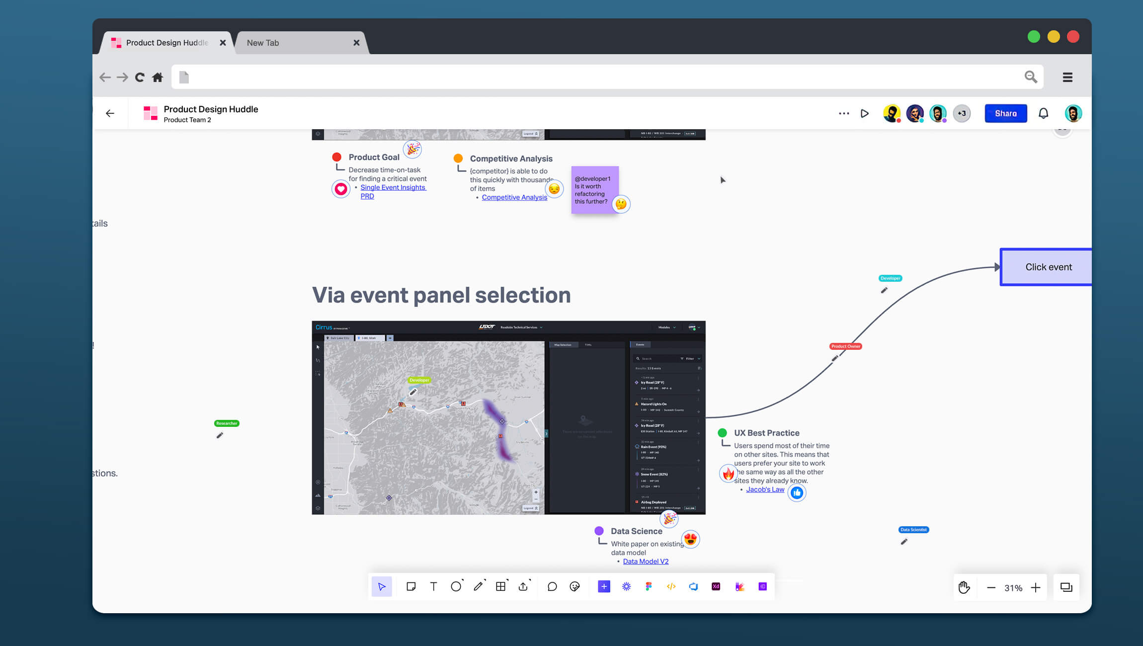 'Tagging,' as I called it,
was encouraged in order to share any additional rationale, or points-of-interest, for why
something is the way it is.
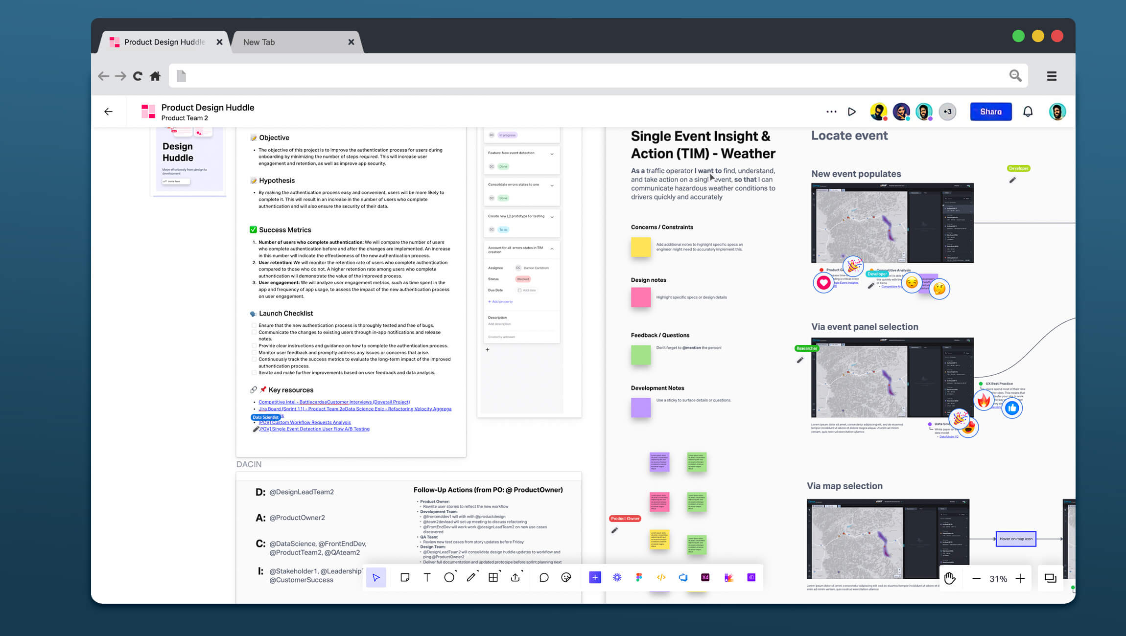 While reviewing the designs,
it's important that we're all on the same page about what we're building, why we need it,
and who's doing what next.
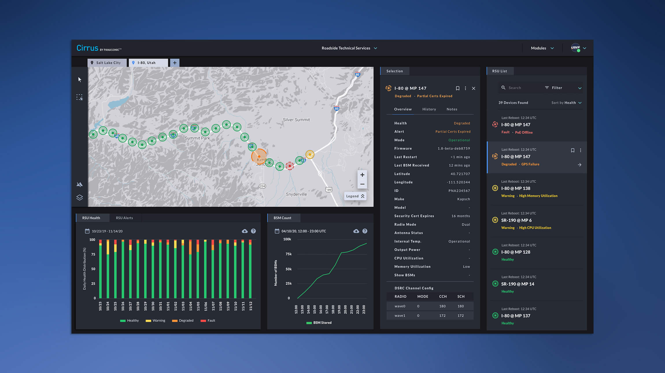 Tab instances allow quick
access to different geographic areas or deployments, where data visualizations will update
accordingly.
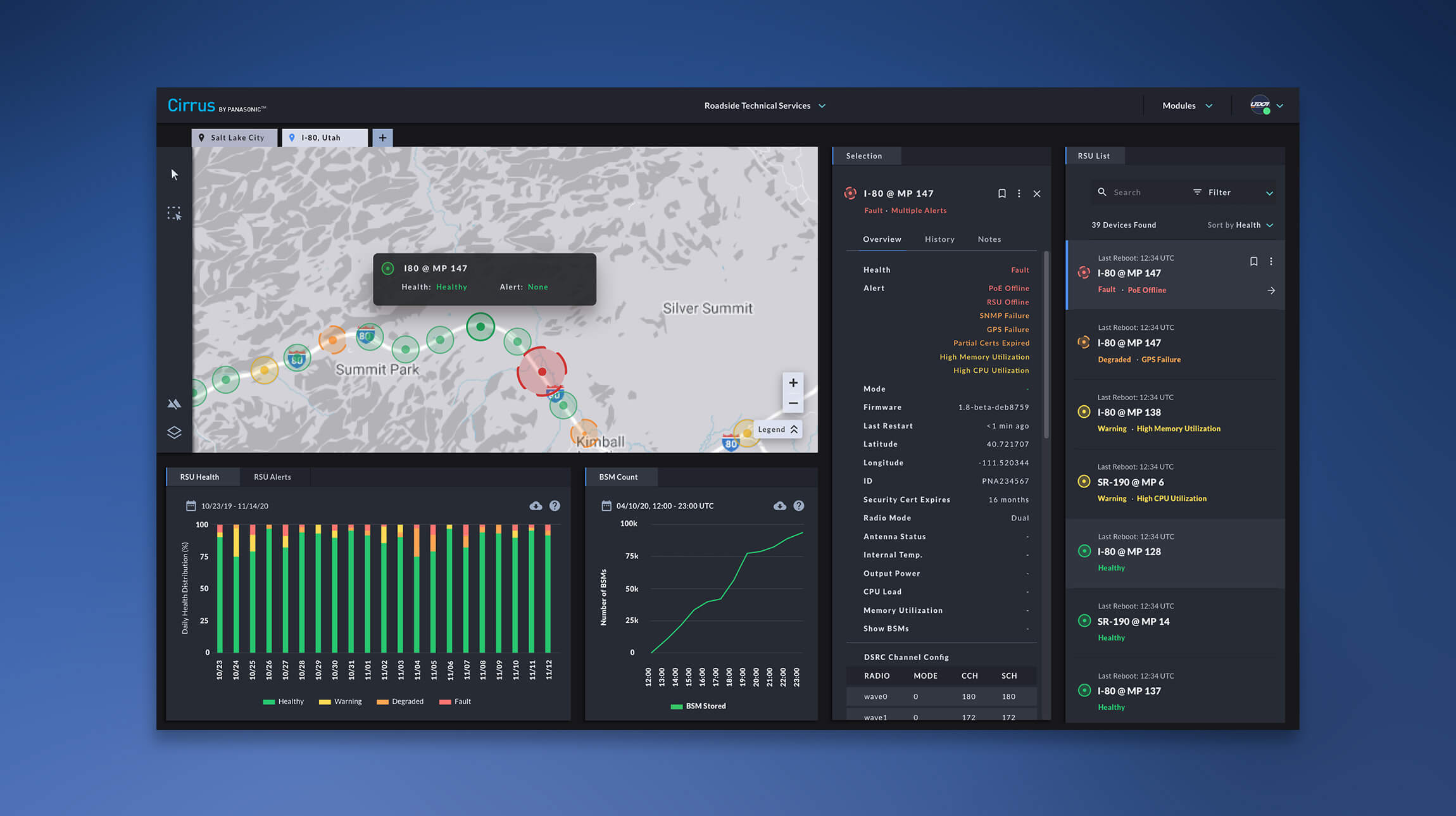 A quick preview of a device is
shown with a prioritized list of criteria for quickly understanding the issue, before diving
into more in-depth troubleshooting data.
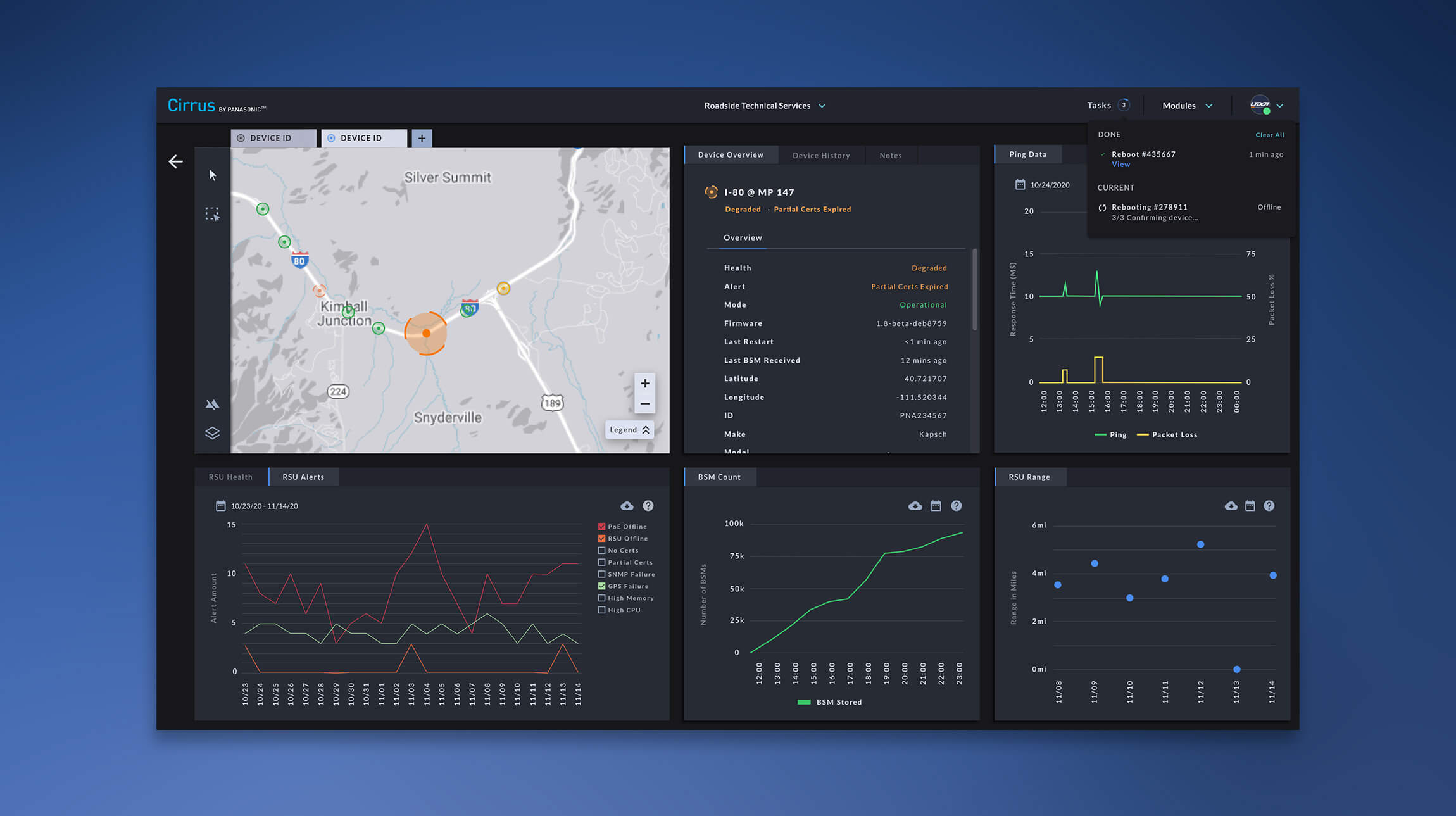 Some actions to remotely manage
operations can be quickly taken on one, or many, devices
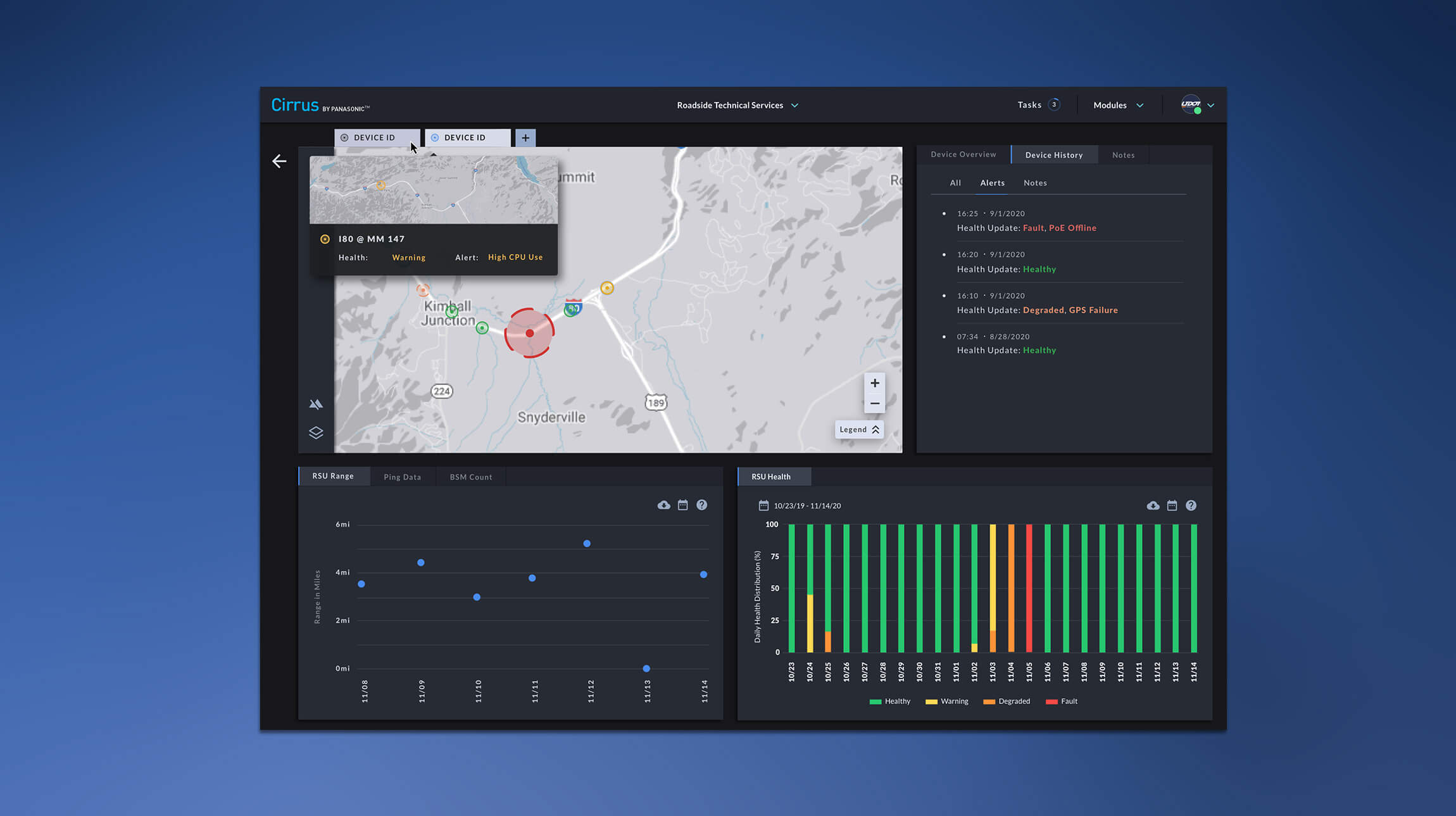 Panels can be rearranged and
combined for different workstation setups and preferences.
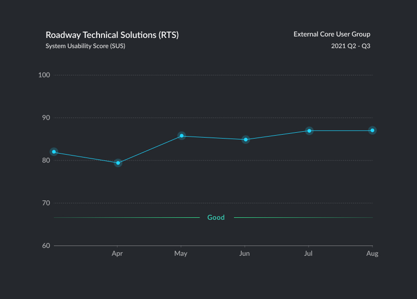 SUS was generally high
above the de facto 'Good' standard of 67
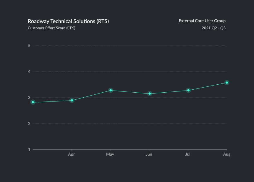 CES gradually increased
at the product level
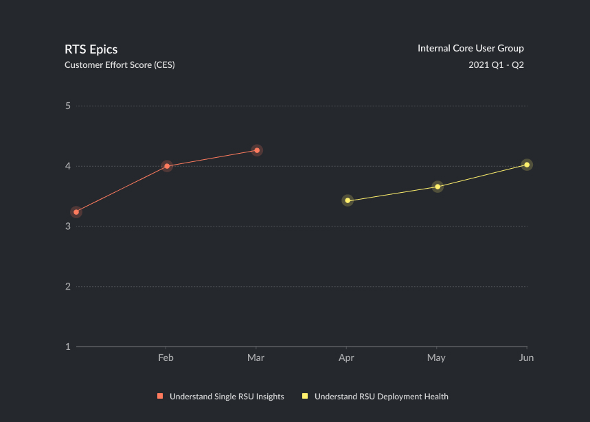 CES was used often for
keep track of our epics, as our session focus and content varied month-to-month
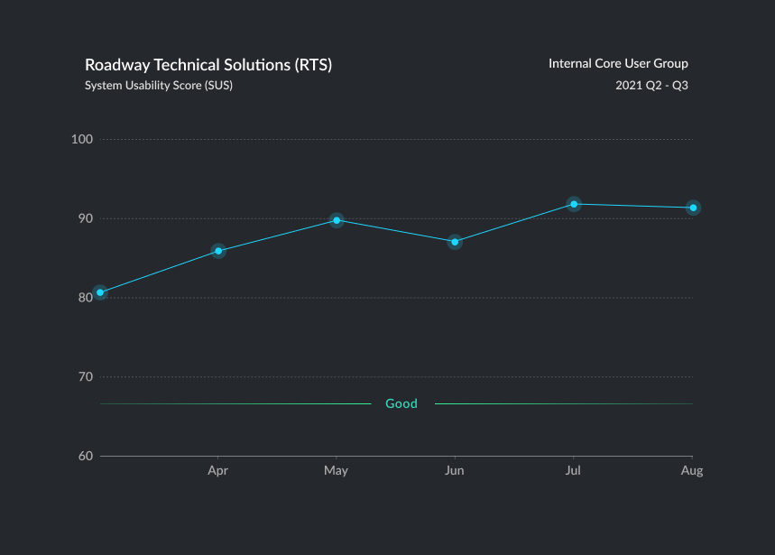 SUS scores were always
higher for our internal group, which is where some bias could exist
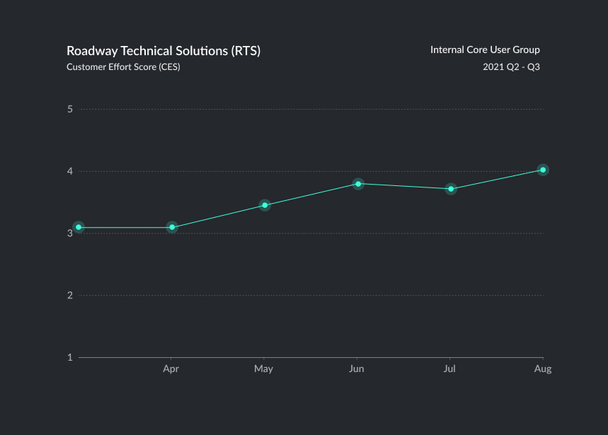 Similar to SUS, CES would
average slightly higher internally
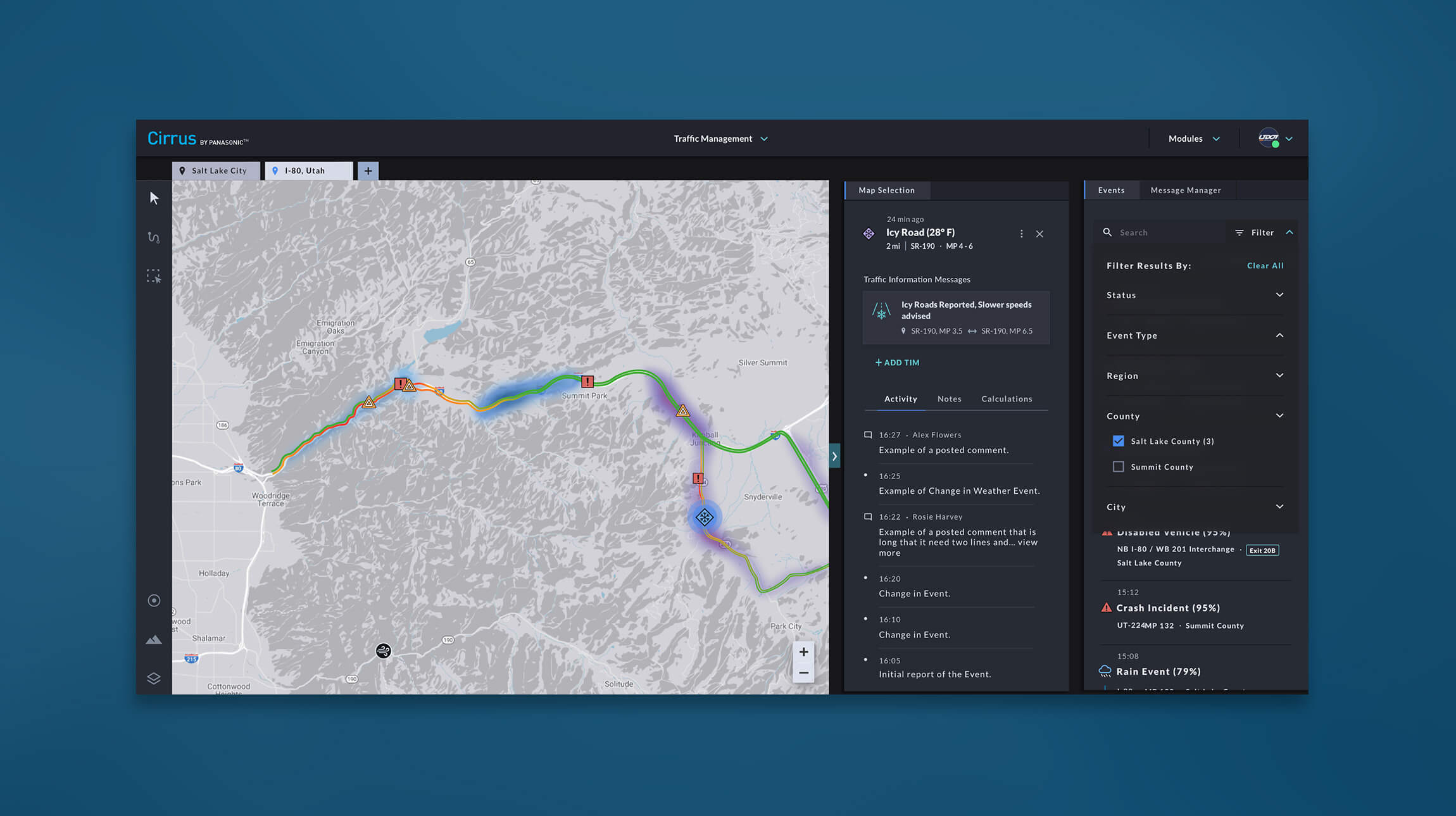 Map selections would show
existing traveller alerts and a timeline of relevant event activity
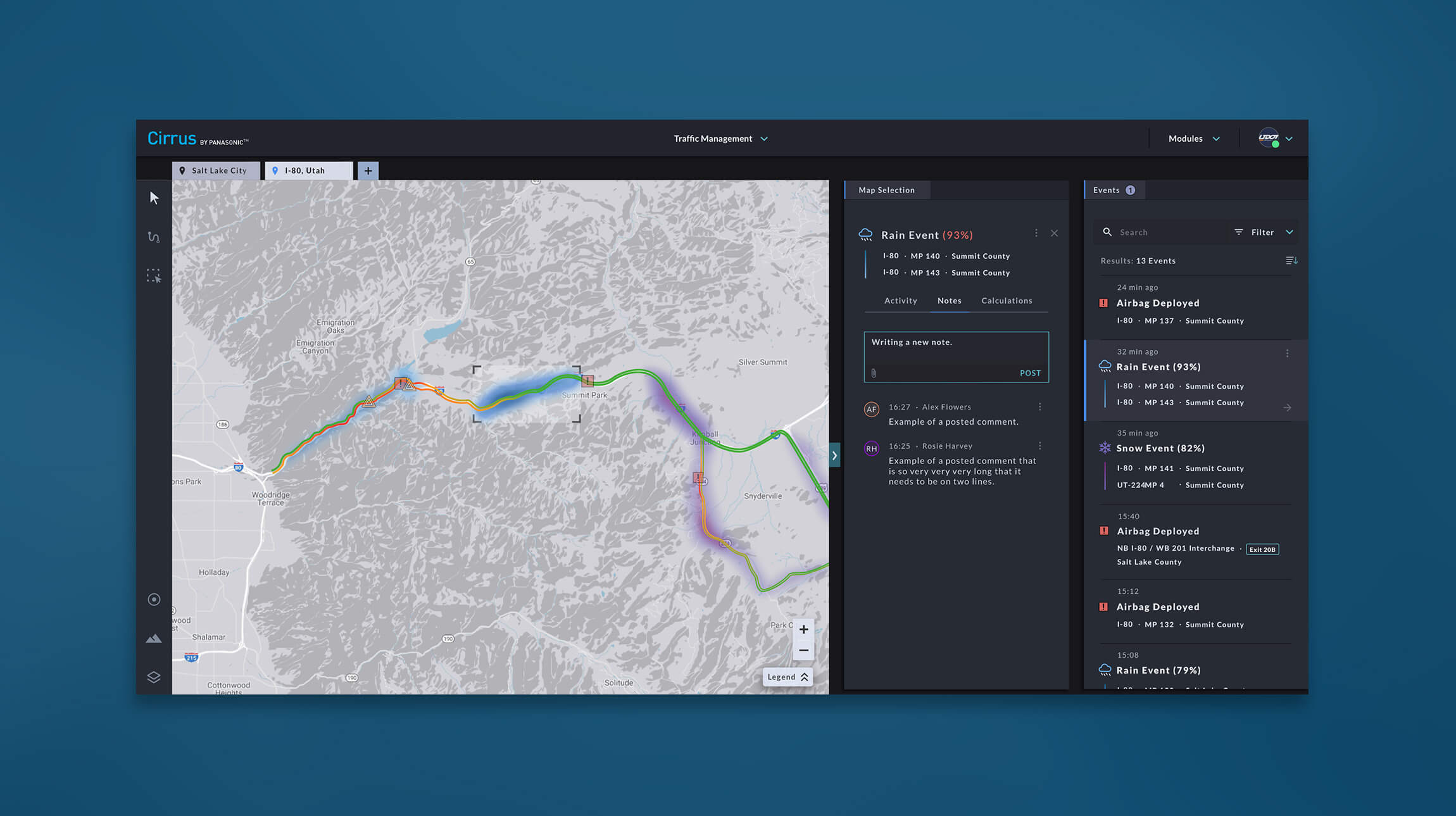 Additional notes could be input
manually
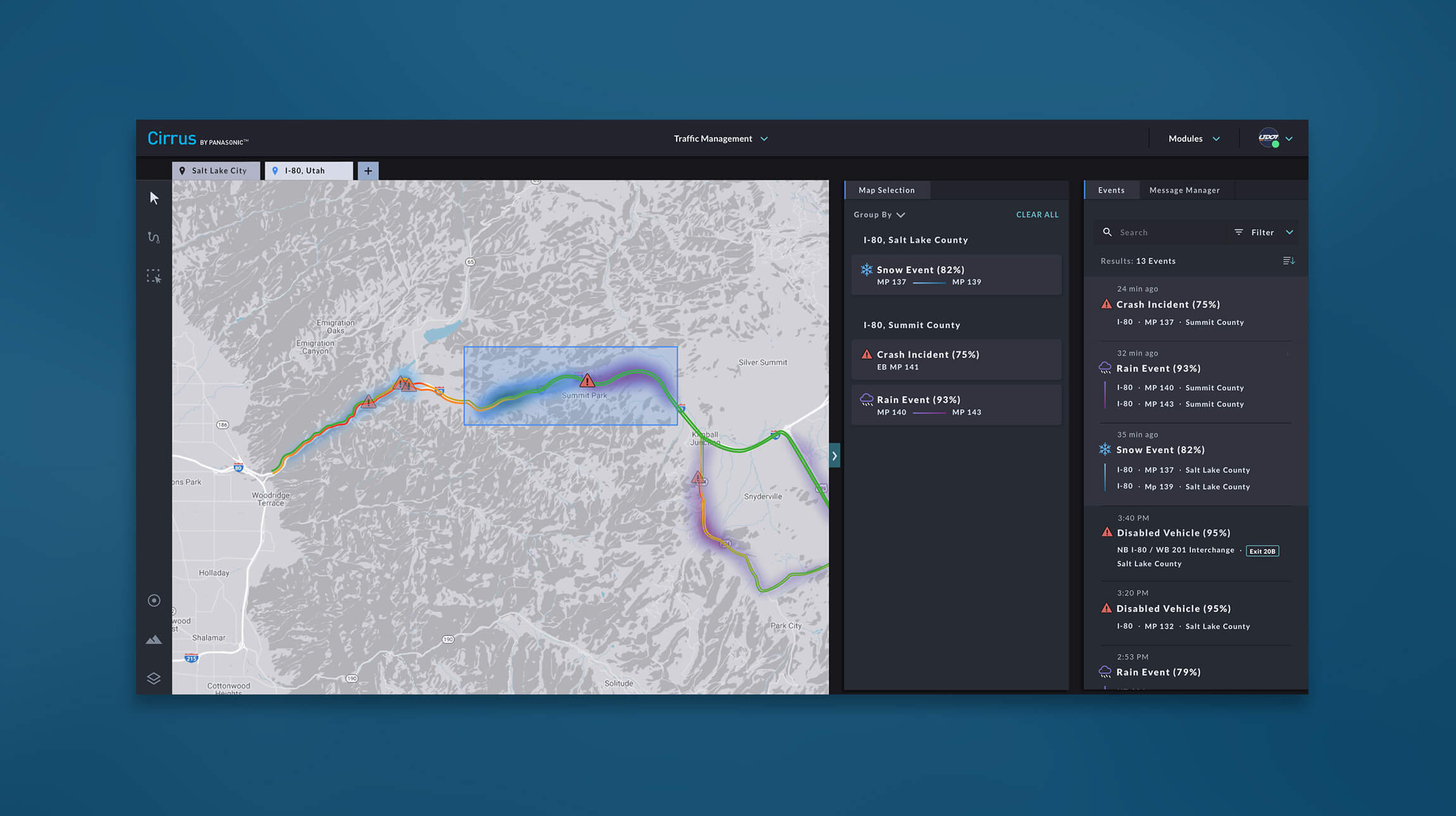 With many kinds of events on
the map, multi-select could quickly grab and show all active events in an area
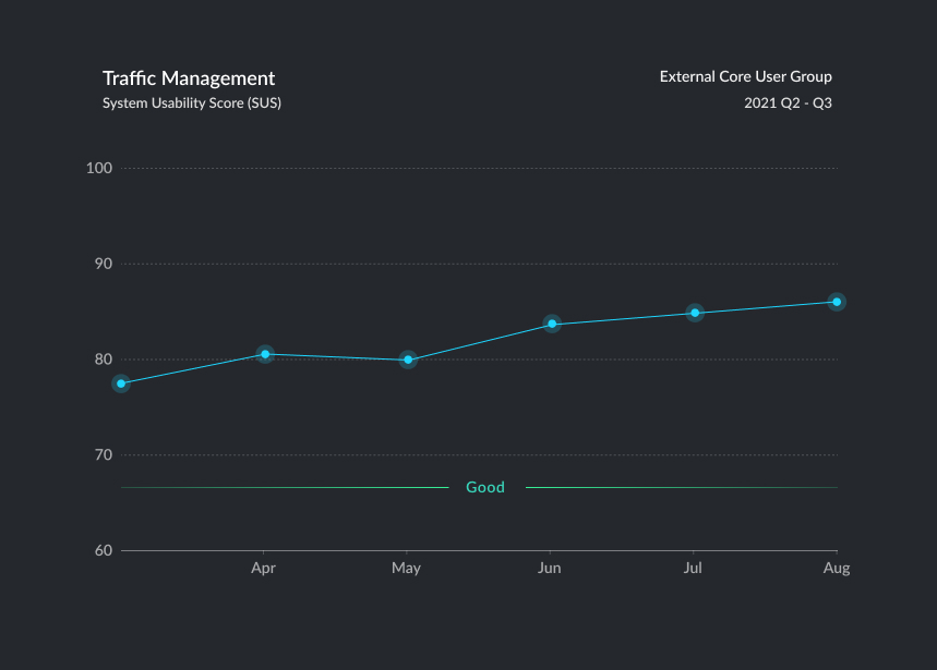 SUS scores started lower,
but grew over time with adjustments
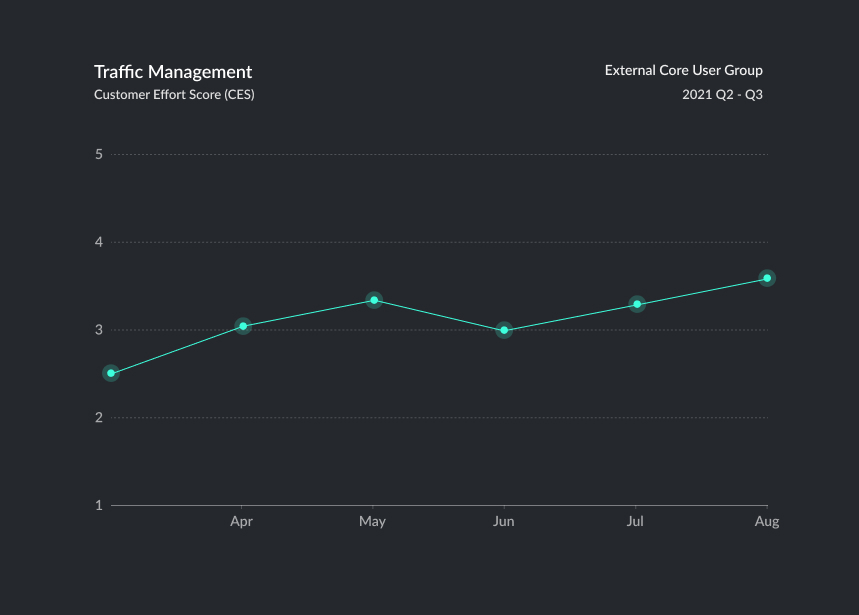 CES followed the same
pattern
 TM also used the epic
tracking framework with CES
