Mobile App for Hotel Management
Problem
Hilton Worldwide's new hotel chain, Tru by Hilton, aims for a new strategic approach which would use a more mobile-centric software solution for its day-to-day operations, which the existing Property Management Solution (PMS) does not support.
Objective
Design a conceptual mobile solution for hotel housekeeping and maintenance hotel employees. The goal is to showcase to leadership and stakeholders how the existing system can translate to an improved, on-brand mobile experience.
Team Role
As the sole product designer, I was responsible for the end-to-end design process, from discovery to high-fidelity prototype. I collaborated with a Senior UX Architect and a technical/back-end subject-matter expert in an Agile/Scrum framework.
Users
The target users are hotel housekeeping and maintenance employees who need a mobile solution to streamline their tasks.
Duration
The project timeline was approximately 8 weeks.
I.
Problem Context
Hilton Worldwide, a global hotel chain with over 4300 hotels, recognized a gap in their market when it came to the millennial age group. To address this, they launched a new brand, Tru by Hilton, which aimed to provide simplified, spirited, and fun experiences for guests.
Additionally, many hotel employees would be mainly using a mobile app for their job responsibilities and accessing rooms using their phone as a digital key.
Rearchitecting the entire data model was not a possibility on the horizon. Therefore the legacy back-end and data schemas, used by their 12 other brands, needed to hook into a new mobile front-end and user experience - a significant challenge in itself.
II.
Discover and Define
With a couple months to deliver something, we wanted to start with some quick discovery on what pain points and frustrations housekeeping staff were having. We also wanted to explore how a mobile solution could fit into their workflow and make their job easier.
We were able to visit a nearby Hilton hotel (not a Tru hotel) and speak with a few of their housekeeping staff over the course of about a week. A handful of other interviews were done over-the-phone. In total, we spoke with 10-12 housekeeping staff over the course of roughly 1 week.
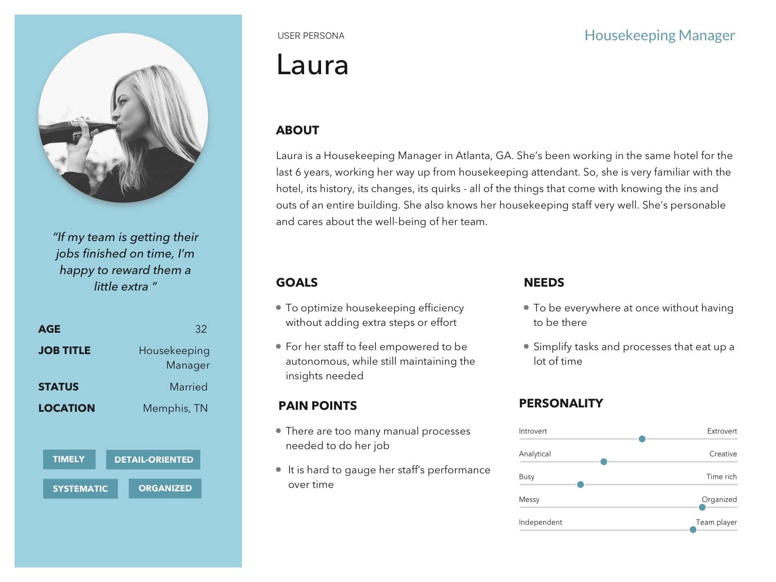
User Personas
Over the course of the following week, the interviews conducted were consolidated and analyzed to create two user personas: housekeeping manager and housekeeping attendant. We only spoke with one maintenance employee briefly, but their actual workflow was very similar to the attendant.
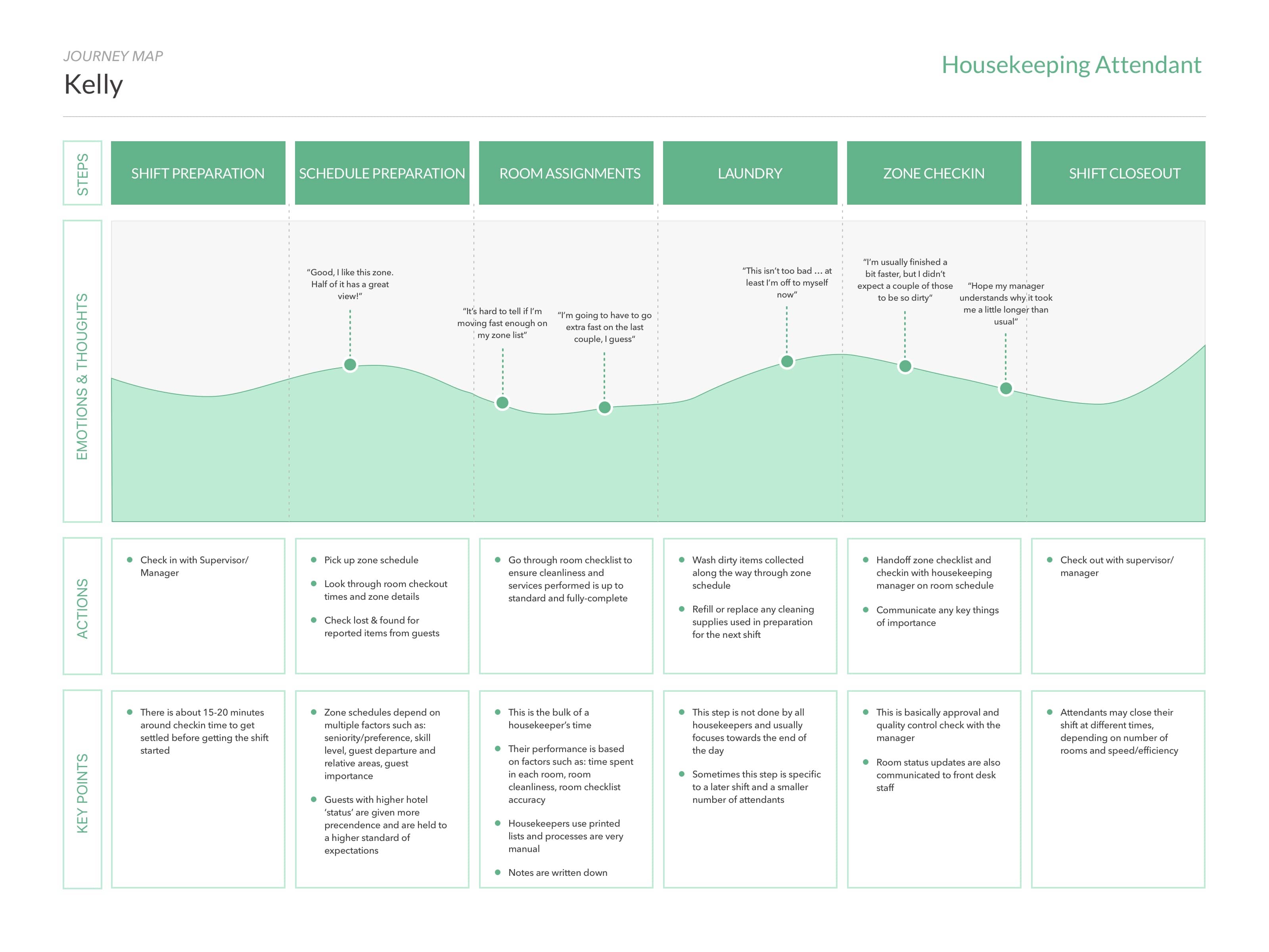
Journey Maps
Based off of the 'typical days' described in the interviews, journey maps were assembled to better visualize our users' daily routines and identified key areas where we could improve their overall experience.
Key Takeaways
While the research done was fairly quick and broad, given the project timeline, there were still some obvious problem areas to focus on for each user group. These areas were:
- Time and performance tracking
- Zone completion efficiency
- Quick insights and communication
III.
Solution Approach
A major business requirement for the project was to incorporate digital room keys, using Bluetooth LTE or NFC features from a mobile phone, instead of physical key cards. Additionally, there was a limited supply of tablet devices that could be available to hotel employees.
We learned from our research activities that there were essentially two user groups we needed to account for in the solution.
Housekeeping attendants and maintenance worker had workflows that were relatively linear, receiving predetermined schedules and tasks which they would attend to based on priority and proximity.
Housekeeping managers, on the other hand, needed to quickly understand broader hotel insights quickly to better respond to shifting context.
As a result, the two key objectives we wanted to focus on were:
- Improving task awareness and organization for attendants and maintenance workers
- Reducing time spent understanding staff operations for housekeeping managers
IV.
Strategy & ideation
Given the above, I could reasonably assume that attendants would only need to use a mobile phone. They are constantly multi-tasking and using both hands. The cart they push around stays in the hallway while they enter guest rooms, so it doesn't make sense that they should carry a tablet device around or attach it to their cart.
Managers did not use a cart and more often had both free hands. This group could actually benefit from the additional screen space a tablet device could provide.
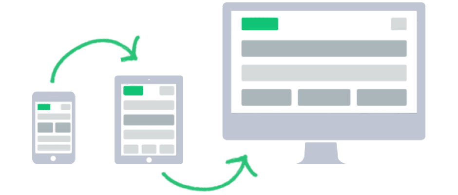
Therefore, it made sense to use the mobile-first approach - starting with the smallest target device and building upwards in terms of complexity and features.
Conceptual Sketches
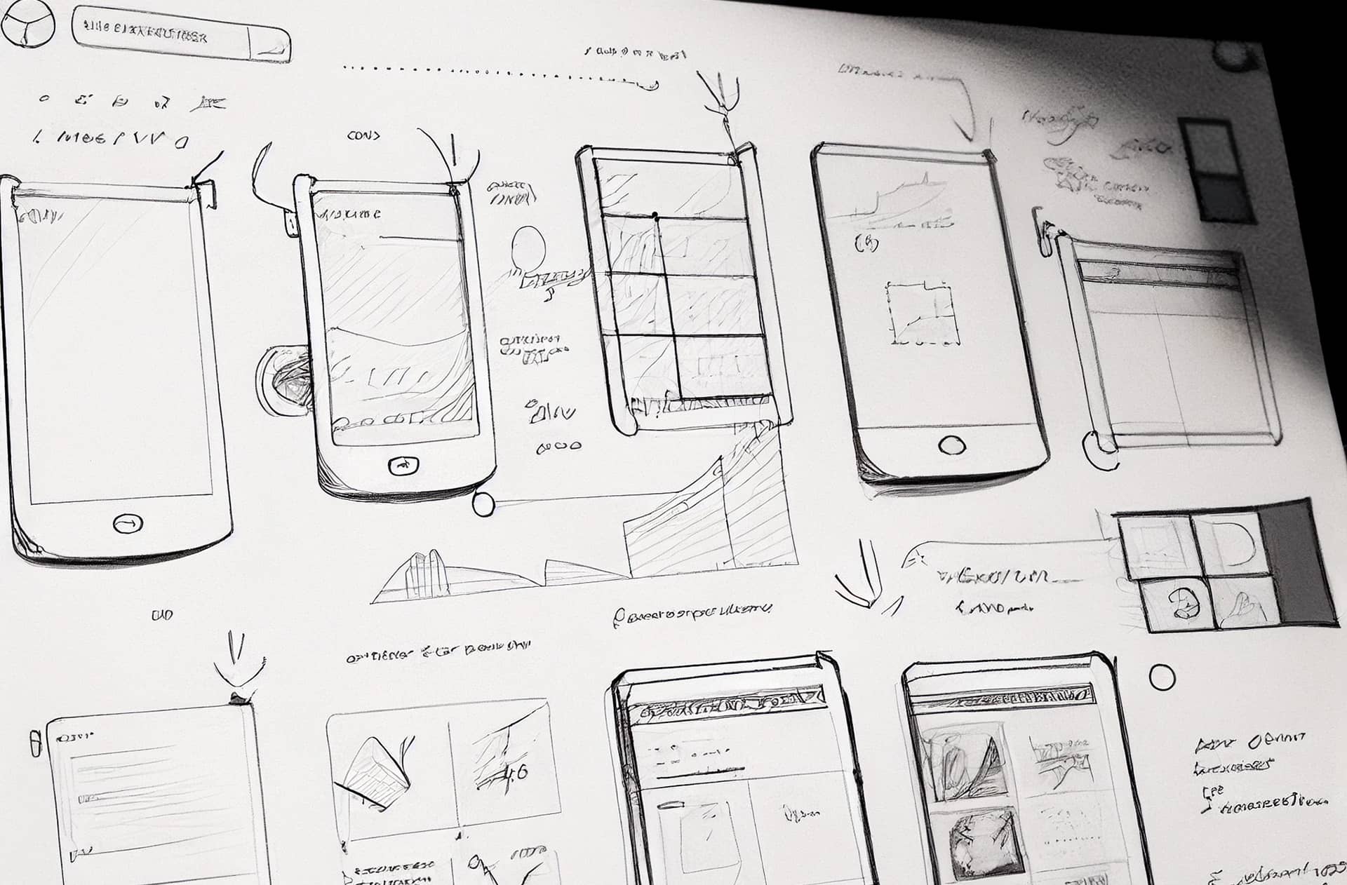
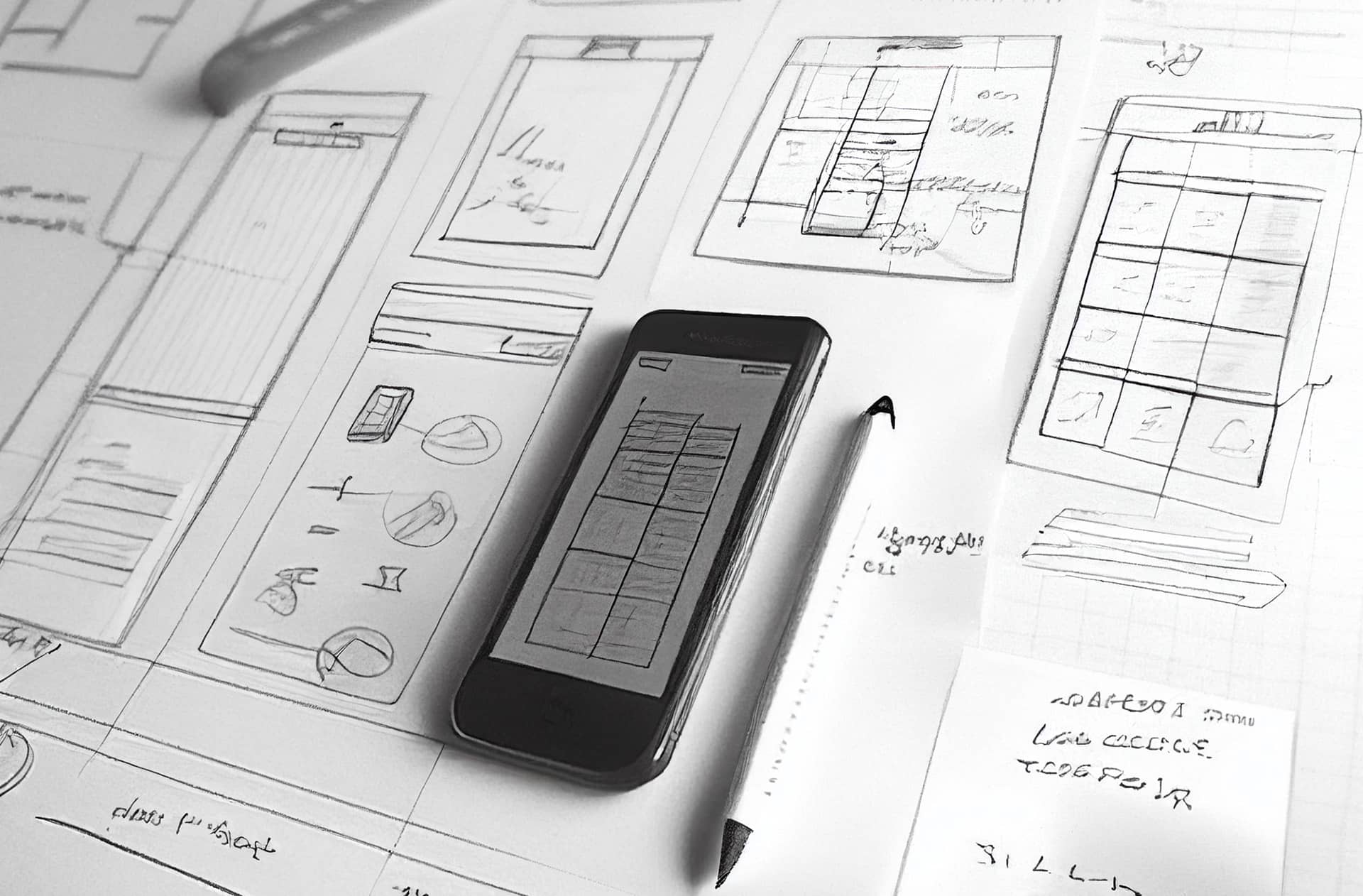
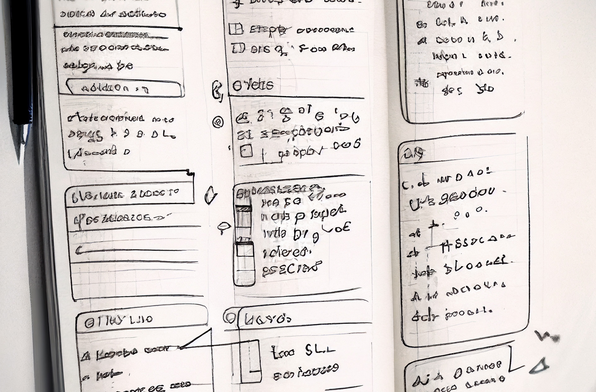
I began with some rough sketches using pencil and paper. While doing this I also referenced any sources of inspiration I could think of. My main goal here was to reprioritize many existing back-end legacy data points into a new content hierarchy and also visualize new ideas that could target the new design objectives.
*Images shown are AI renders to simply illustrate my design process in this project. My sketches are unfortunately not around anymore.Lo-Fi Wireframes
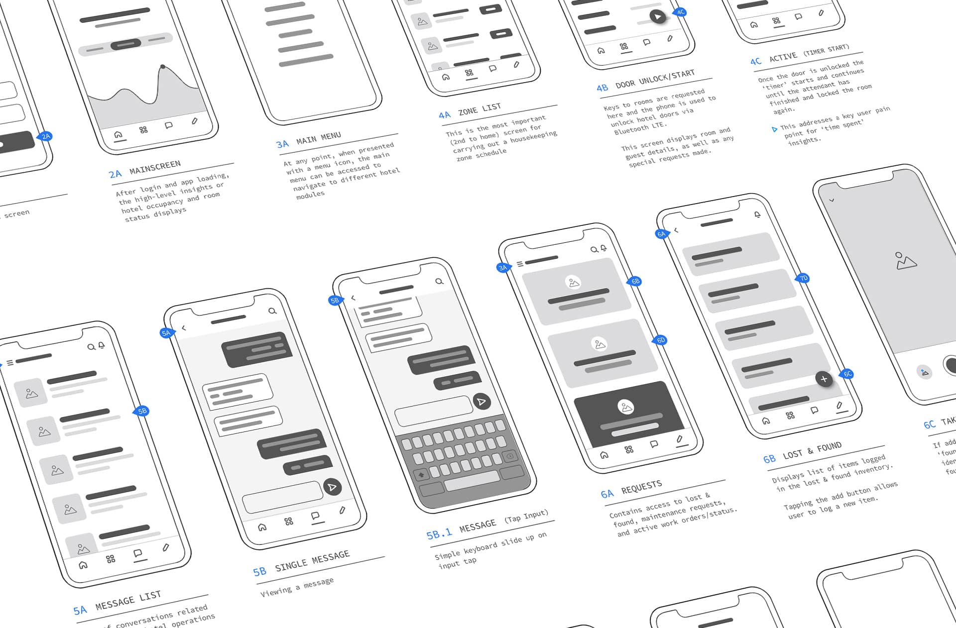
After working through some sketches I started wireframing some screens out using a Sketch UI kit. The mobile app, at this point, was going to be an HTML5 hybrid app. Both iOS and Material design principles were referenced for the general layout.
I created a high-level architecture of the screens needed, showing where each interaction would generally navigate to. It also made it easy to neatly documenent where certain business, or user, needs were being addressed. The goal was not to cover all edge case scenario or logic, since this was not going to development.
Timer Unlock Feature
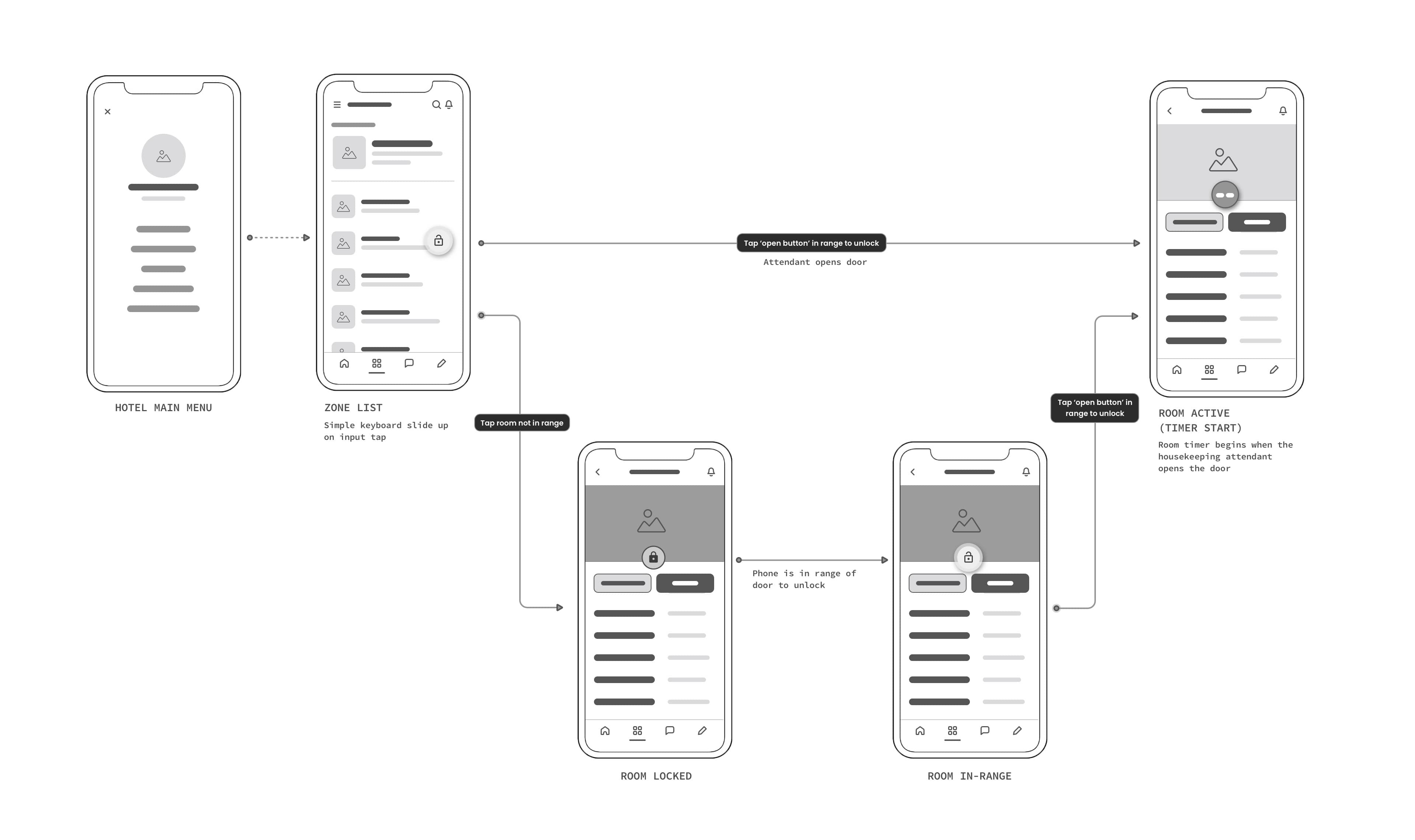
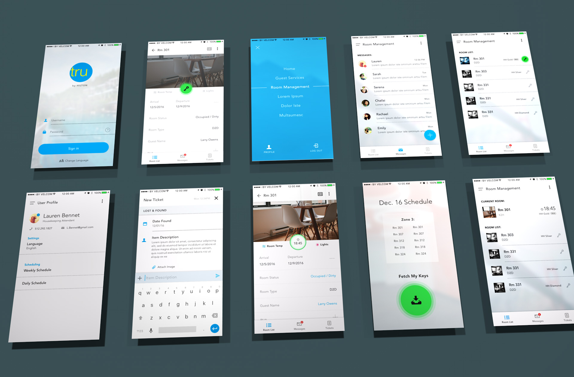
While developing the wireframes, I thought of a feature that could solve the digital key business requirement, as well as some user pain points. By pairing the door unlock feature with a timer, the housekeeping attendants have immediate insights into how long they have spent cleaning any given room. Based on the size of the room and level of cleaning required, they are able to see how much time is usually spent cleaning any given room. Housekeeping managers can also reference this metric in a number of ways to get better insights into day-to-day operations.
V.
Visual Design
In this project, I visually took somewhat of a 'Complexion Reduction' approach for several reasons. This approach not only resonated with contemporary design trends (AirBnB, Apple, Spotify), but also provided an effective visual solution to keep the interface clean and content-focused for users on-the-move. Its focus on simplicity, usability, and content accessibility aligned perfectly with the design objectives, as well as the branding guidelines of the Tru by Hilton brand.
By adopting this approach, I emphasized bold headlines, removed extraneous imagery and color, and simplified icons for enhanced recognizability. This resulted in a sparing using of focused color that allowed the content to take center stage and ensured clear functionality.
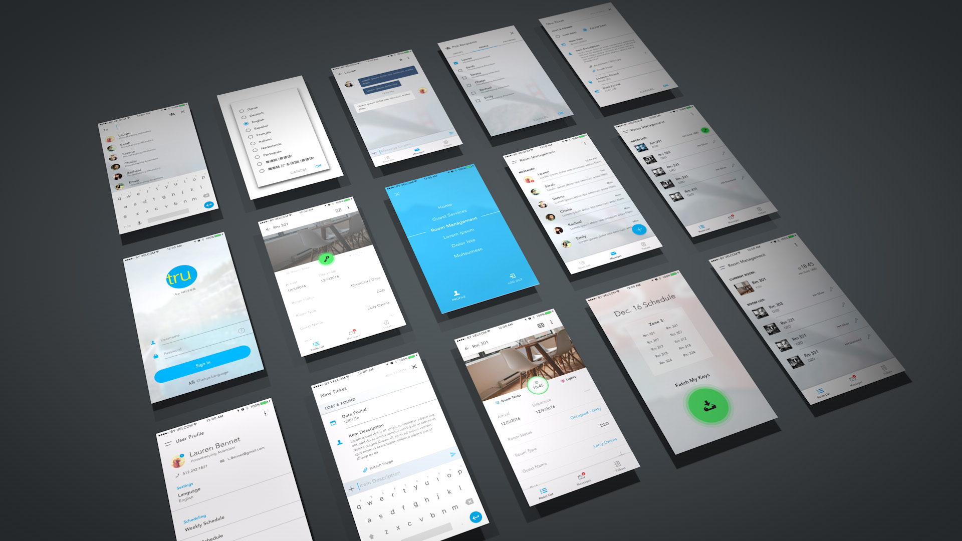
Attendant Mobile Screens
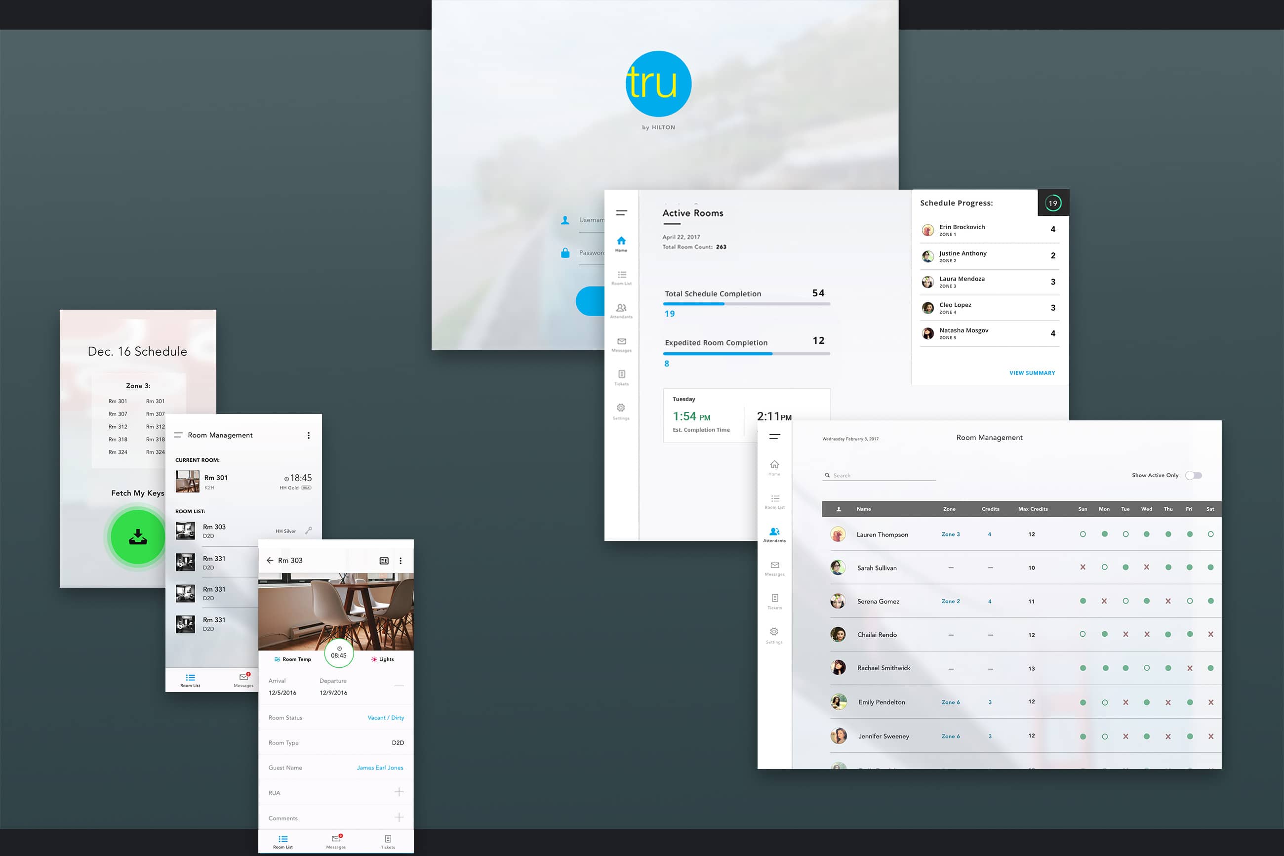
The 'timer unlock' and 'key retrieval' features took visual dominance so it was clear when the digital keys were available to act on. When a key is used in-range of a door (must exist on zone schedule), it would seamlessly transition, and animate, into the active timer.
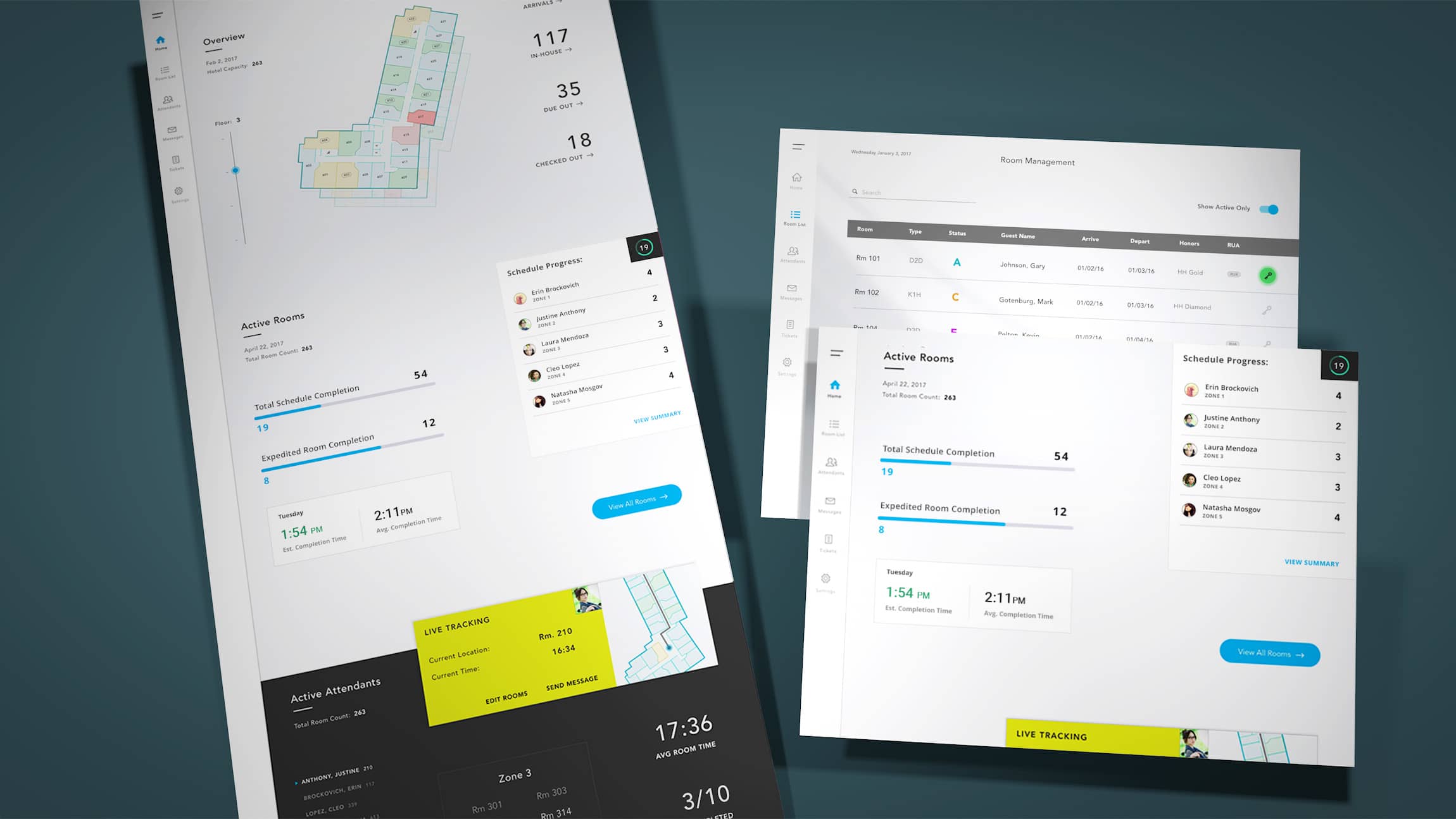
Manager Tablet Dashboard
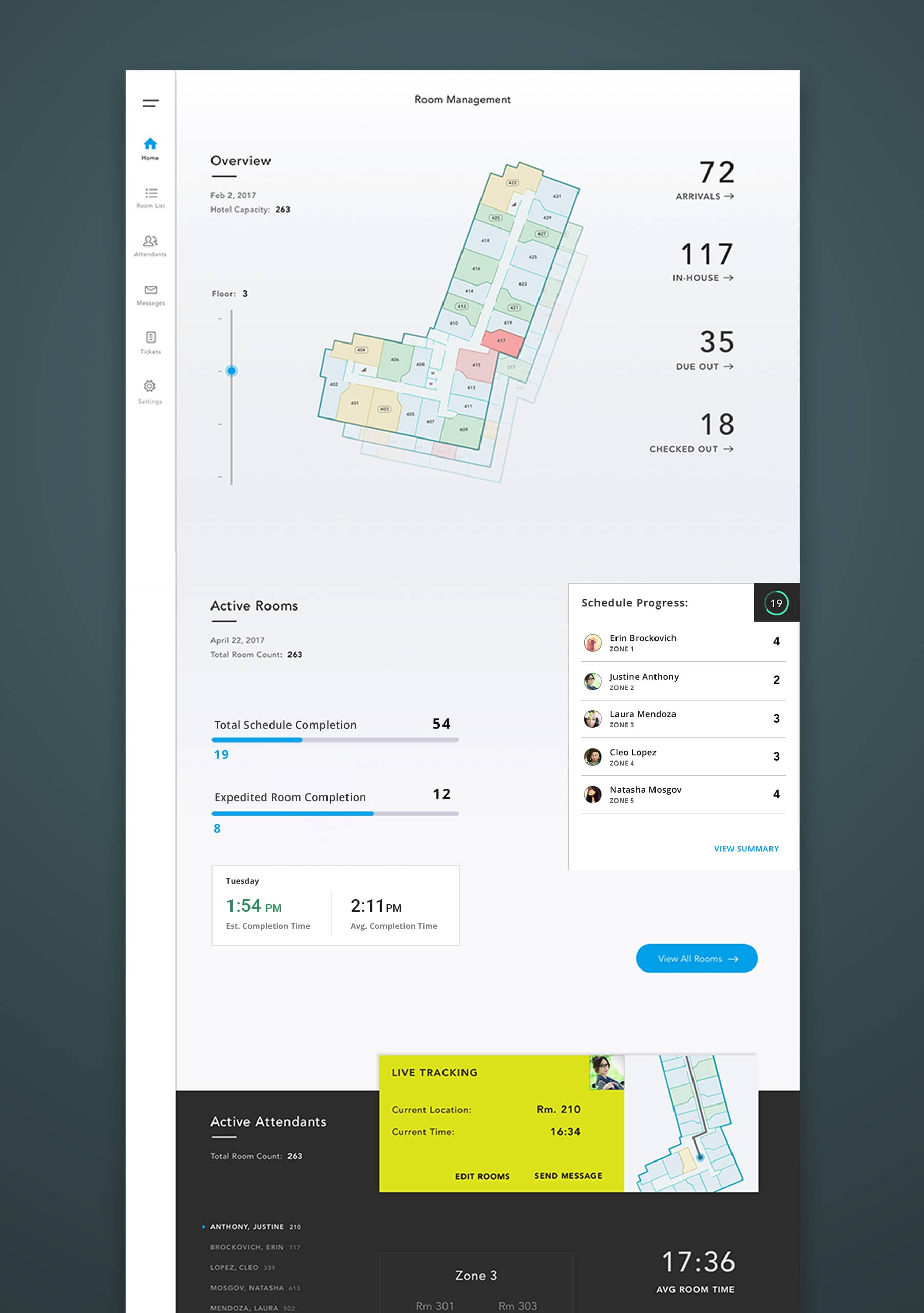
The manager side of the housekeeping app aimed to reduce time spent on understanding staff operations. Using a mobile-first approach with progressive enhancement, it supports existing workflows while offering additional features for user groups needing more oversight.
The home screen hierarchy includes informative insights for general hotel status, scheduled room completion, active attendants, and lost and found to quickly see and act as needed.
Dashboard Animation
The primary solution for quick room statuses and updates is an interactive floor plan, where users can zoom in and out of the hotel floors and update/override room status as needed.
Proposed Next Steps
This concluded the extent of what was needed to present the mobile concept and product direction to stakeholders and leadership. The proposed next steps to be taken were:
- Conduct usability testing on prototype(s) for the mobile phone app
- Gather metrics and feedback from users on both mobile device solutions
- Interview other internal stakeholders on the expectations for product success
VI.
Conclusion & Impact
The project was presented to stakeholders and some leadership executives. The timer unlock feature was highly praised. Other concerns were simply around how the tru by Hilton brand should translate to a mobile application - visual tweaks that would be needed.
While the feedback was mostly positive, the underlying strategy and direction of the project remained somewhat unclear and vague. Stakeholders did not seem to be aligned on the business requirements of the project.
As a result, both the impact of the work, and the next steps, were not clear.
VII.
Retrospective
After the project kick-off was completed and presented, there were several thoughts I had on the work and outcome.
The project was very waterfall. Ideally we would have been able to test some early designs or wireframes with some previous housekeepers, or with new ones. Unfortunately, this was not prioritized as a necessity until after the first iteration and pitch. Because of this, there were a lot of assumptions made based on a relatively limited amount of research done up front.
Since this was new, exploratory concept there weren't any existing analytics or insights to go off of. Therefore, measuring success for what was designed would simply be a baseline and not an additional benchmark of UX success.
On the bright side, it was fun to have the freedom to explore a number of solutions for a mobile product that had never existed. Other than a brand guideline, I got to imagine how Hilton software (not just one brand, or even just housekeeping), could exist in a mobile form - which is pretty cool.
