Oilfield Training & Education
Immersive Training for 3D Simulation
Role
Product Designer
Client
Halliburton
Date
2014 - 2015
Tools & Frameworks
Adobe CC, Axure RP, Balsalmiq, Visual Studio, WPF
Problem
New employee training programs for oilfield workers are not adequately preparing new hires for the real-world jobs, environments, and complex problems they will be facing due to the limitations of course material and training methods.
Objective
Bridge the knowledge gap for new hires in oilfield industry by creating an interactive, immersive training platform which allows them to practice real-life drilling operations using a laptop or three-screen workstation.
Team role
I worked on a small team of four designers with 3D animation, gaming, and mobile backgrounds. My role on this project was focused on developing the core app experience in, and around, the 3D environment.
Users
The target users are future rig workers who need to transition from training materials and certification to real-life job scenarios.
Duration
I worked on this project through many iterations over the course of about a year.
I.
Problem and opportunity
Halliburton, a global drilling operations company with a vast workforce of over 40,000 employees in 80 countries, recognized a significant problem. New employees lacked practical knowledge and experience needed for real-life working scenarios, despite completing training programs. Halliburton needed a solution to better prepare new hires for the complexities and challenges of their jobs.
The eSimulator project was created as an advanced training tool, providing virtual simulation of real-world job scenarios, supplementing course materials and teachings.
By using immersive, interactive scenarios, the eSimulator project aimed to bridge the knowledge gap and better prepare future oil rig employees to succeed in the field.
II.
Understanding our user groups
We didn't have any dedicated UX research activities, findings, or metrics to work with, and we couldn't conduct any either. However, we made the most out of what we had. Our understanding of the two user groups, students and teachers, came from the product owners and internal project stakeholders. Despite the limitations, we made sure to always keep these user groups in mind throughout the design process.
Who were the students?
The students were located all over the world and had a mix of in-class and at-home learning. They were preparing for roles in oil rig operations, which could be either onshore or offshore. While the students were competent in their course material, they needed additional help in understanding the contextual actions required in their future jobs - the intangibles they couldn't learn from a textbook.

Who were the teachers?
The course trainers, on the other hand, were experienced oil rig workers responsible for preparing students to succeed in a high-pressure, high-stress environment. They were looking for ways to customize scenarios and problem difficulties to cater to their students' unique needs.

III.
Leveraging stakeholder expertise
Although we didn't have direct access to users, we had the privilege of working with seasoned veterans in the oil industry who had the technical know-how and access to vital information that was instrumental to understanding the pain points and edge cases we were looking for with each feature. While this is definitely a conflict-of-interest between user and client, we used this source of 'testing' as best we could.
Key focus areas
By collaborating with our product group and stakeholders, we developed several foundational principles that guided our design process.
- Ensure that the logic, naming, and details in the design reflect real-life operations as closely as possible.
- Consider the experience of students across a range of three skill levels, from strong guidance to none.
- Always keep in mind how easy it will be for trainers to configure and manage the system.
IV.
Product requirements
Before jumping into the solution design, I knew ahead of time that there were three modules/components that would make up the rig simulator project:
- Job Picker - a way for both students and trainers to both choose from, and create custom, types of job scenarios to run.
- String Component Selector - a way for students to manually assemble an entire drilling string (the piping assembly that goes deep into the ground) for that job.
- 3D Training Simulation - the actual 3D simulation would run and allow the student to carry out the job scenario, with a path to succeed and many, many ways to fail.
The rig simulator product needed to work for students on both three-screen workstations in classrooms, and on a laptop for use at-home/on-the-go.
V.
Simulator design strategy
The strategy for the simluator module was to basically treat it as if it were an oil drilling role-playing game. We would use gaming principles, unique characters, interactions, and animations to create the immersion we were looking for.
This module needed to take full-advantage of the three-screen workstation as a few different views and environments needed to be accessible and visible at all times for the students. This also applied for the laptop.
I used an adaptive design approach from multi-screen priority down to single-screen laptop while working through the various simulator components.
Rigfloor sketches
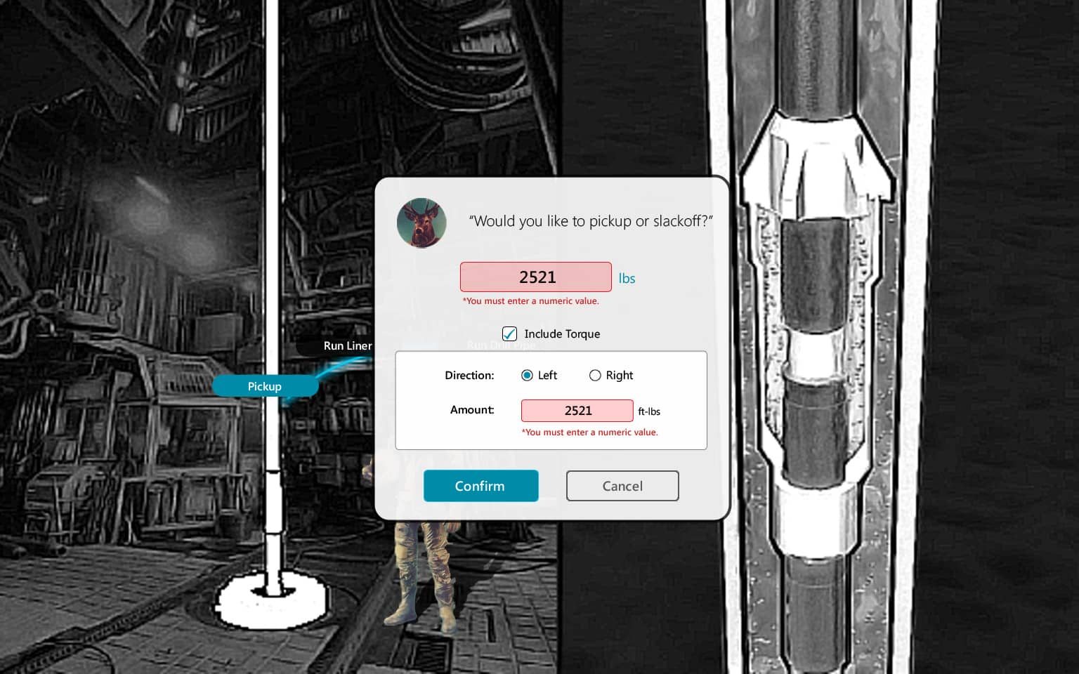
One of the first things I did was brainstorm on all of the driller character states needed in the rigfloor environment (pictured here as a deer in a spacesuit). By working with our 3D artist/animator and the engineering team, I could see what kind of visual result we would end up with.
Using subtle visuals of glowing animations and a conversational dialog tone, we thought this would create something that feels a little fun and may help maintain users' interest better.
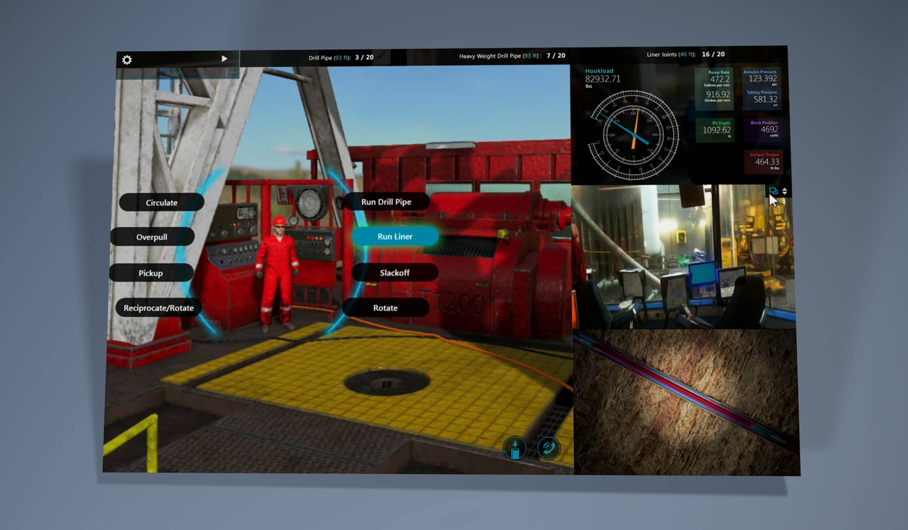
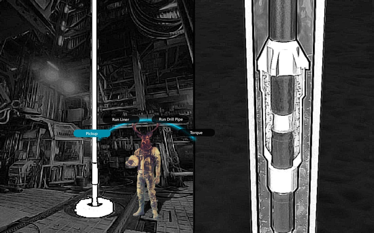 Driller actions
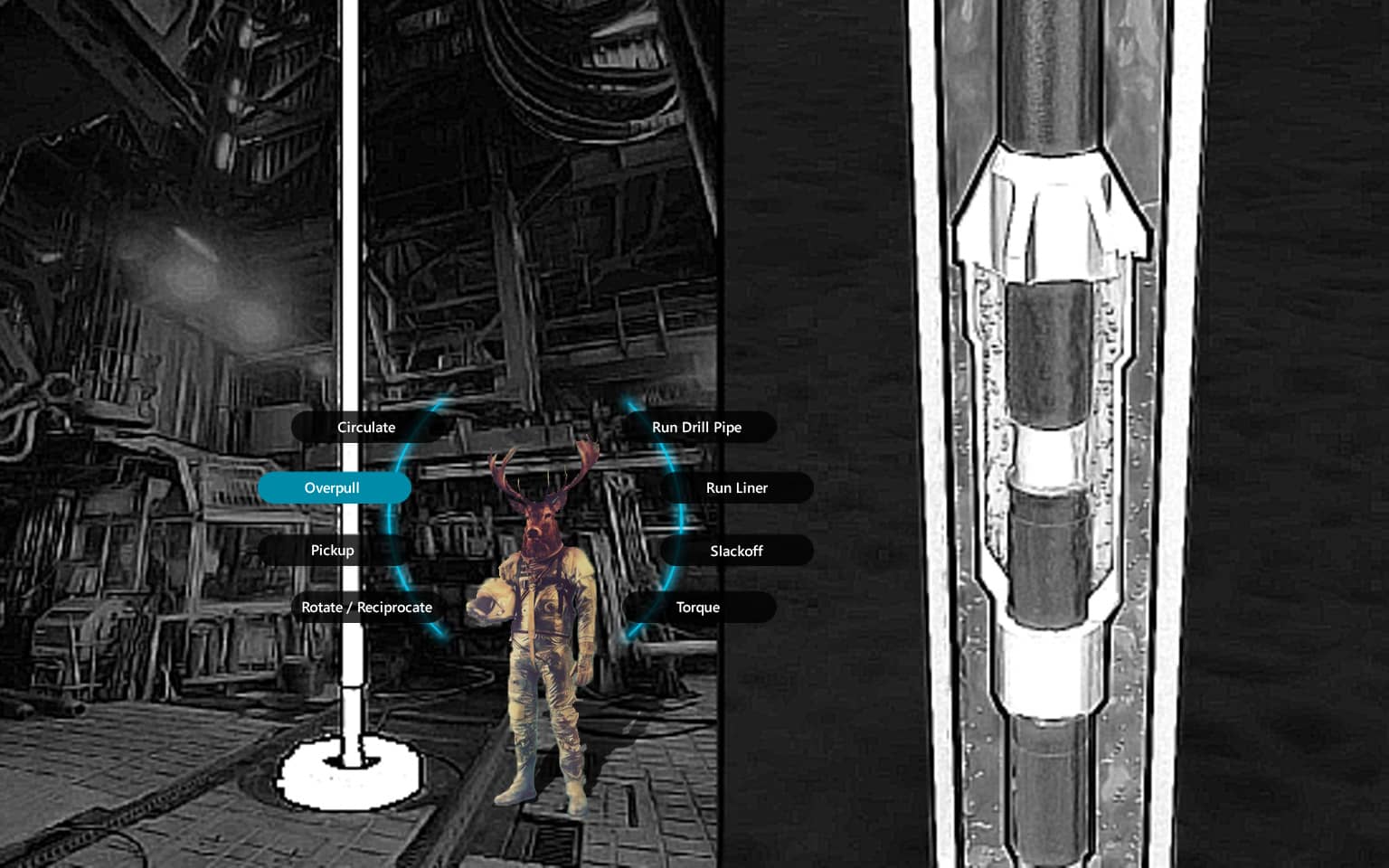 Driller with many actions
 Dialog to user
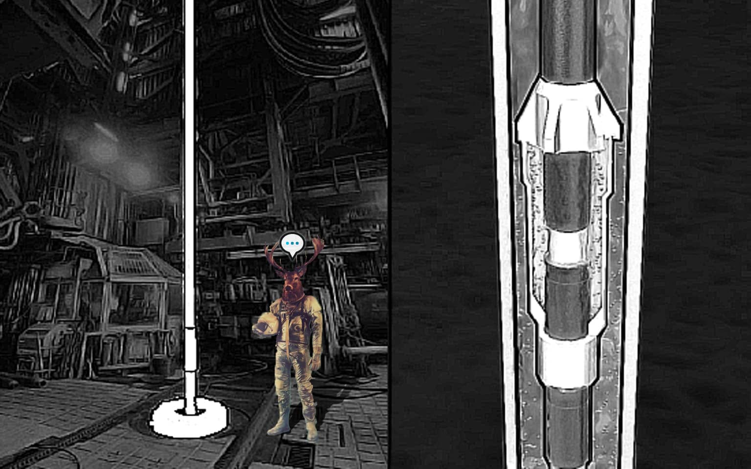 Driller wants to speak
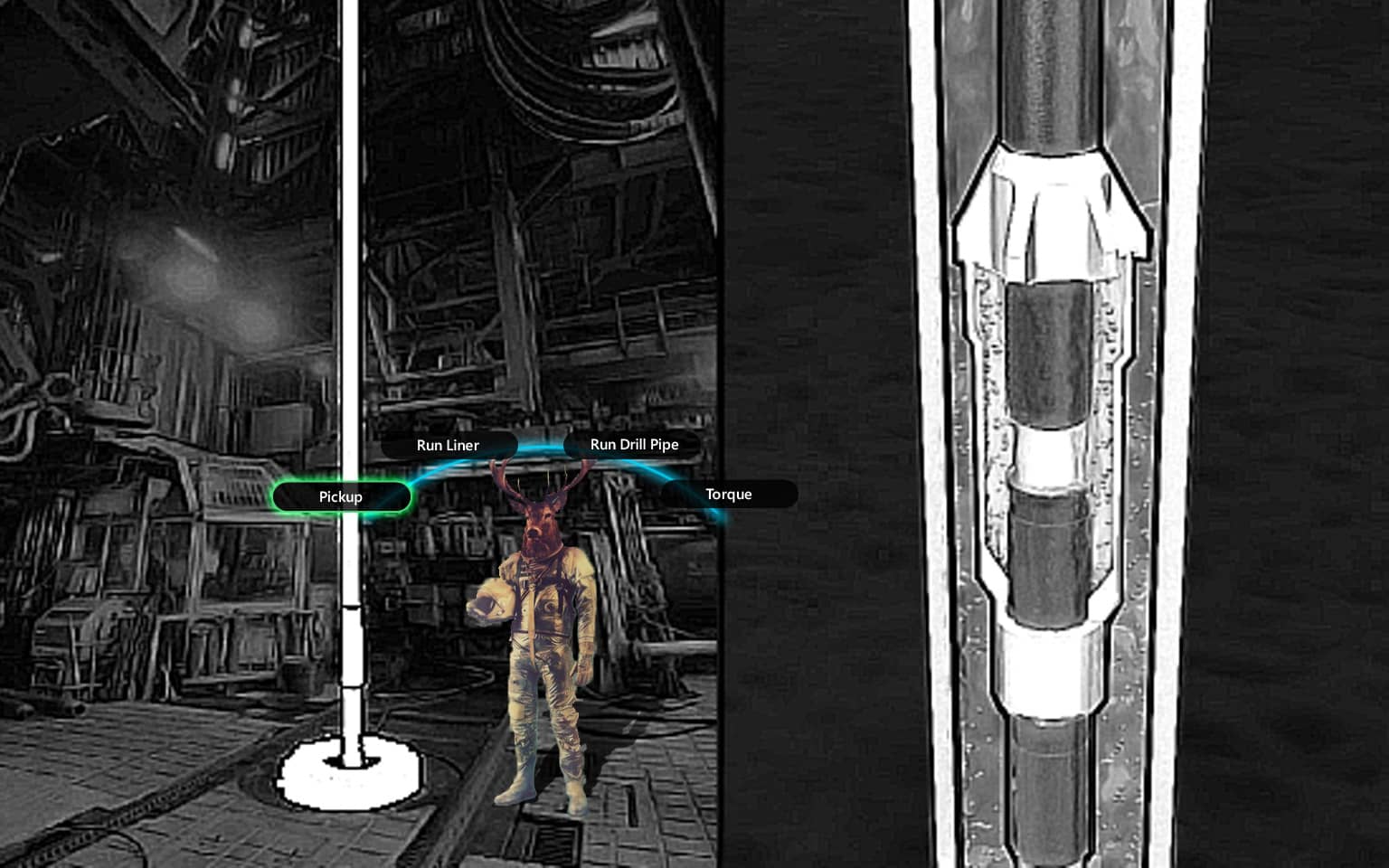 Next step hint
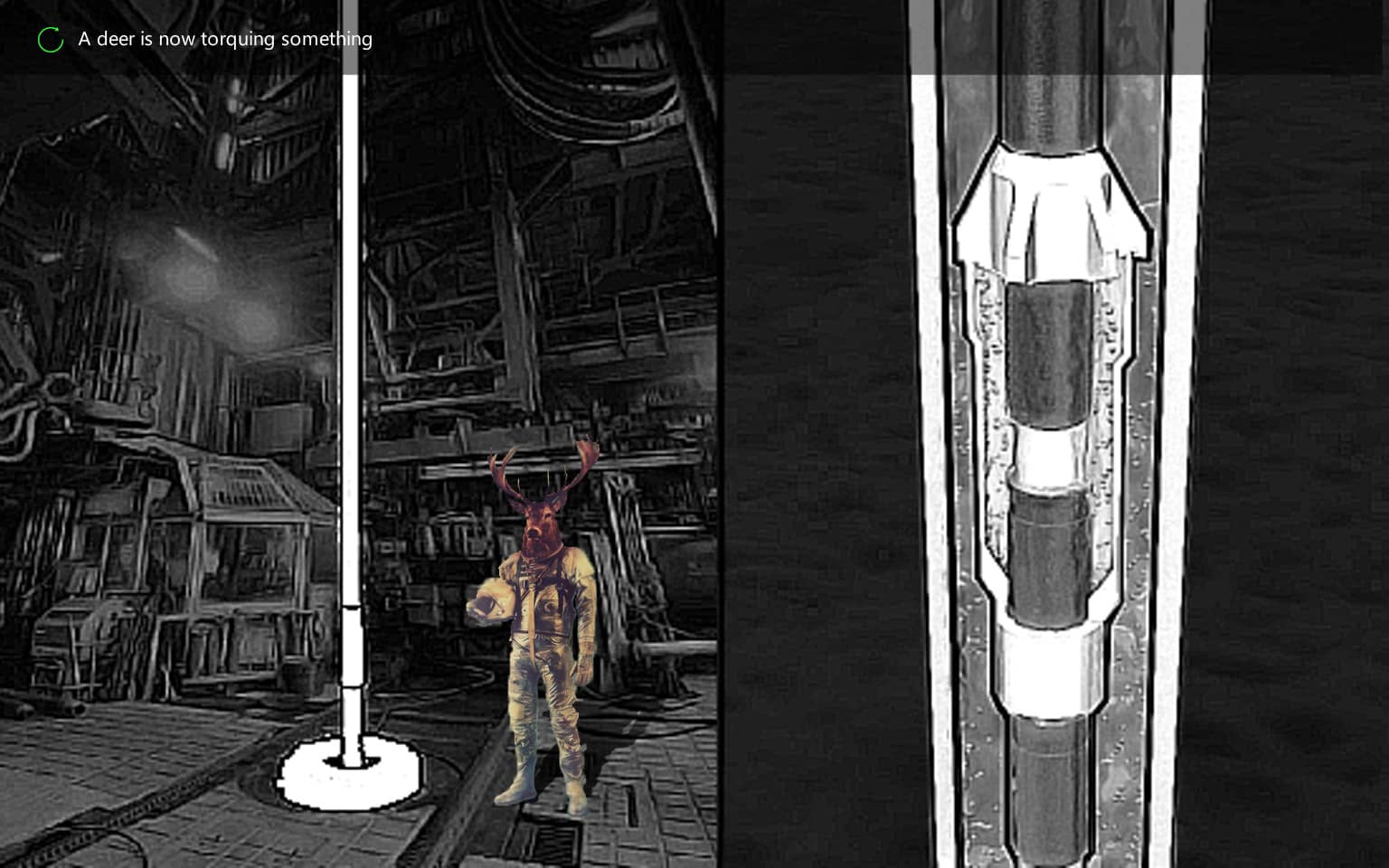 Scene actions in progress
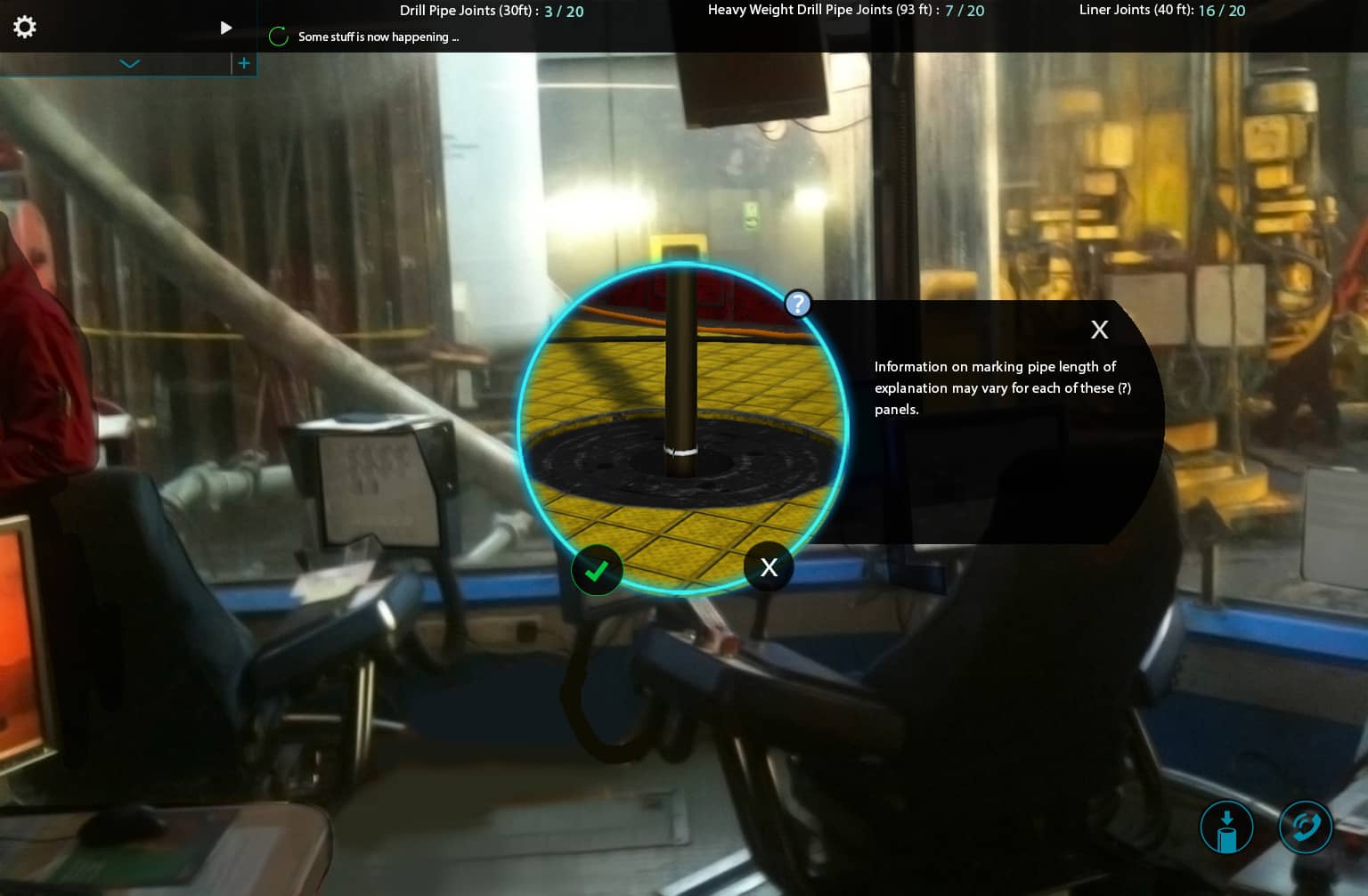
Non-character interactions
Next, I iterated through how the surrounding interface would look and function outside of the character interactions. We needed to integrate a step-by-step procedure with job instructions, an area to make calls to other off-screen characters, and a running count of used materials. One of the challenges here was striking a balance between obscuring the rig background and making the alternate actions clear and visible enough.

Drillshack operations
Users needed real-time visibility into communications between the drillshack operator and rigfloor drillers (pictured here as a sloth in a spacesuit). Although the guide in the top-left corner and green hints were limited to the easiest difficulty level, helpful tips and explanations were always available when additional context was necessary. This feature enabled users to better comprehend the rationale behind specific actions and learn proper procedure.
 Call operator dialogue
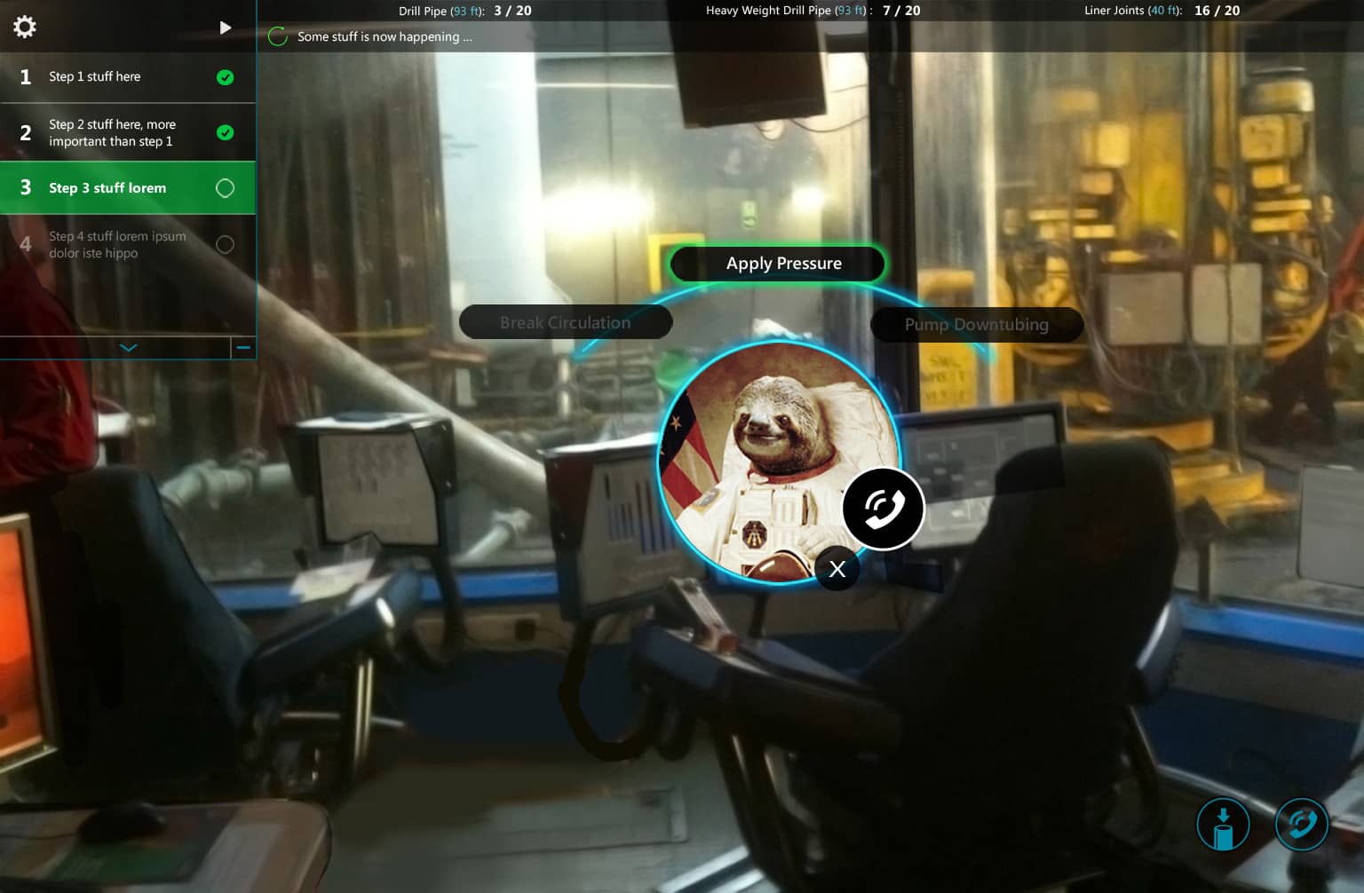 Guided Mode Hint
 Educational prompts
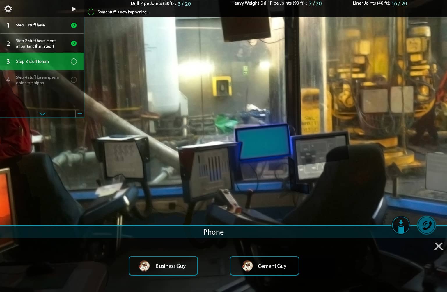 Call slideup
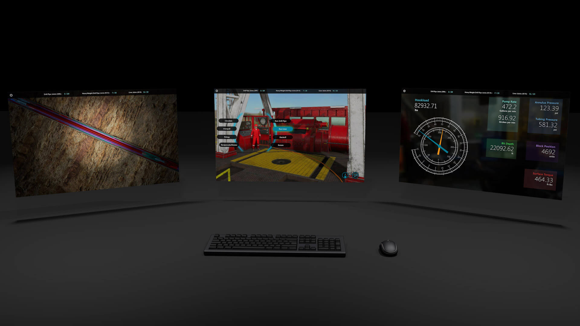
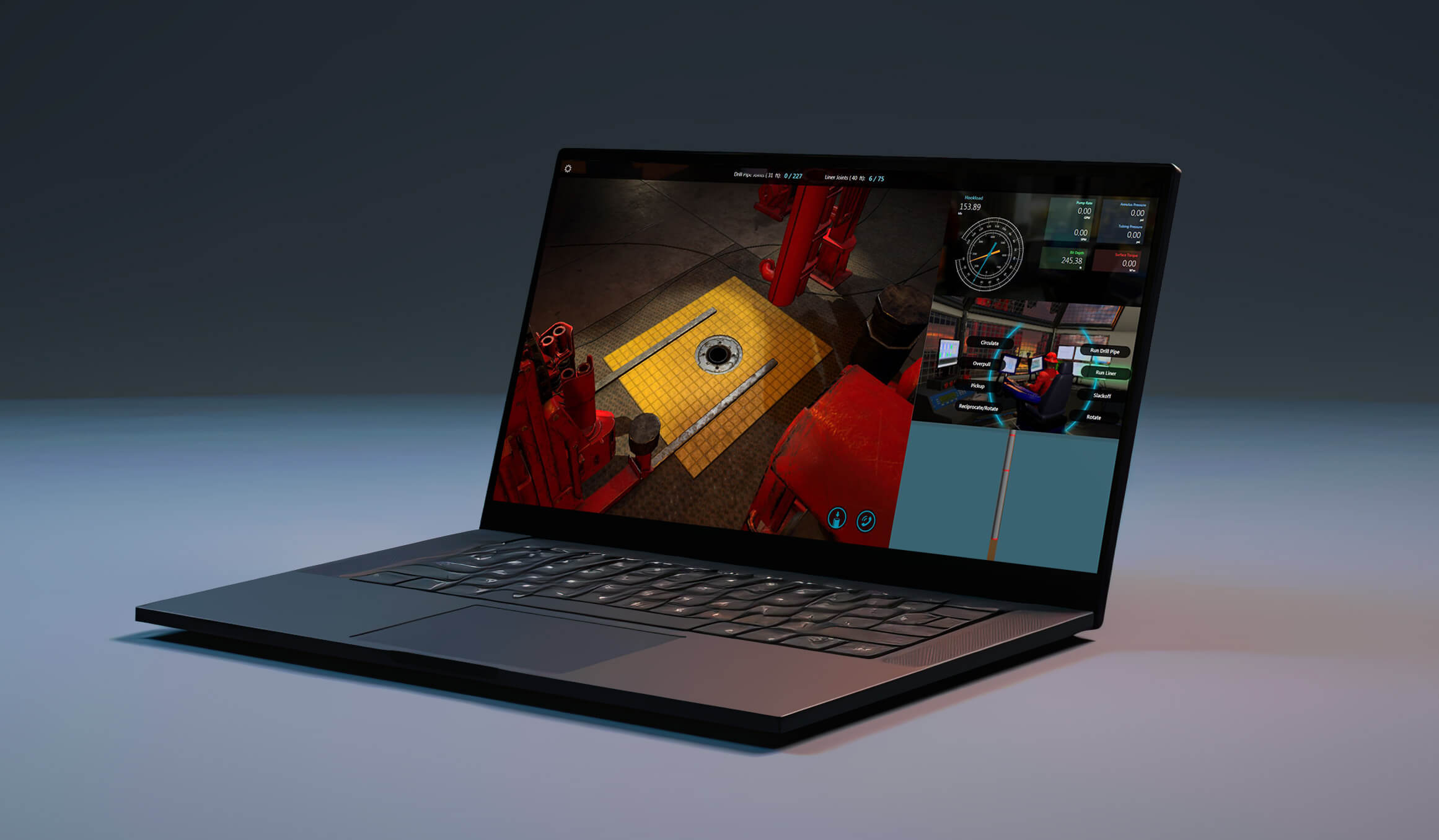
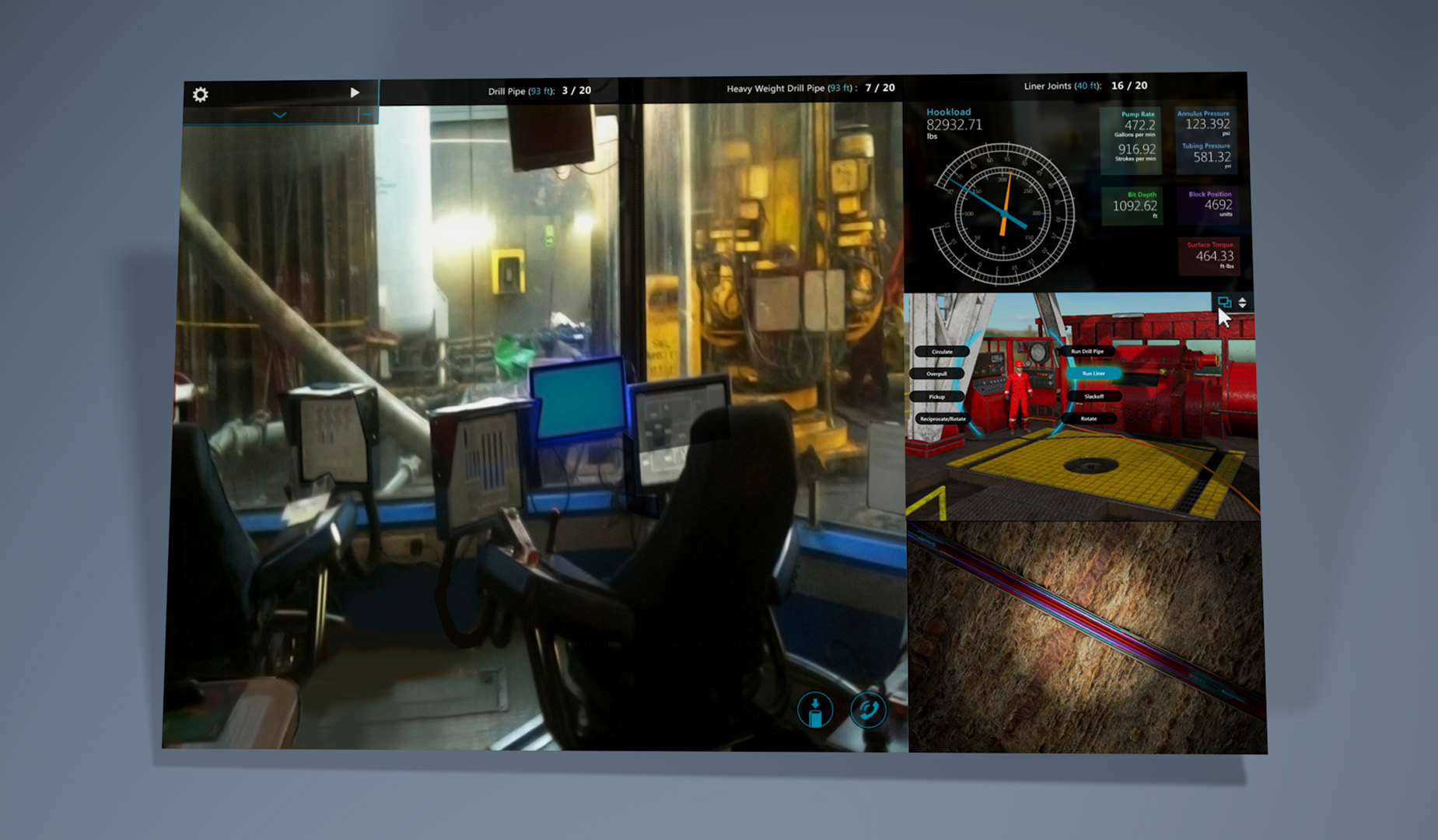
Three-screen workstation
With the addition of a 3D downhole view and a real-time dashboard of gauges, the complete simulator workstation started coming together. This allowed students to get a comprehensive, detailed understanding of the entire drilling process. These views could also be configured in any order based on user preference.

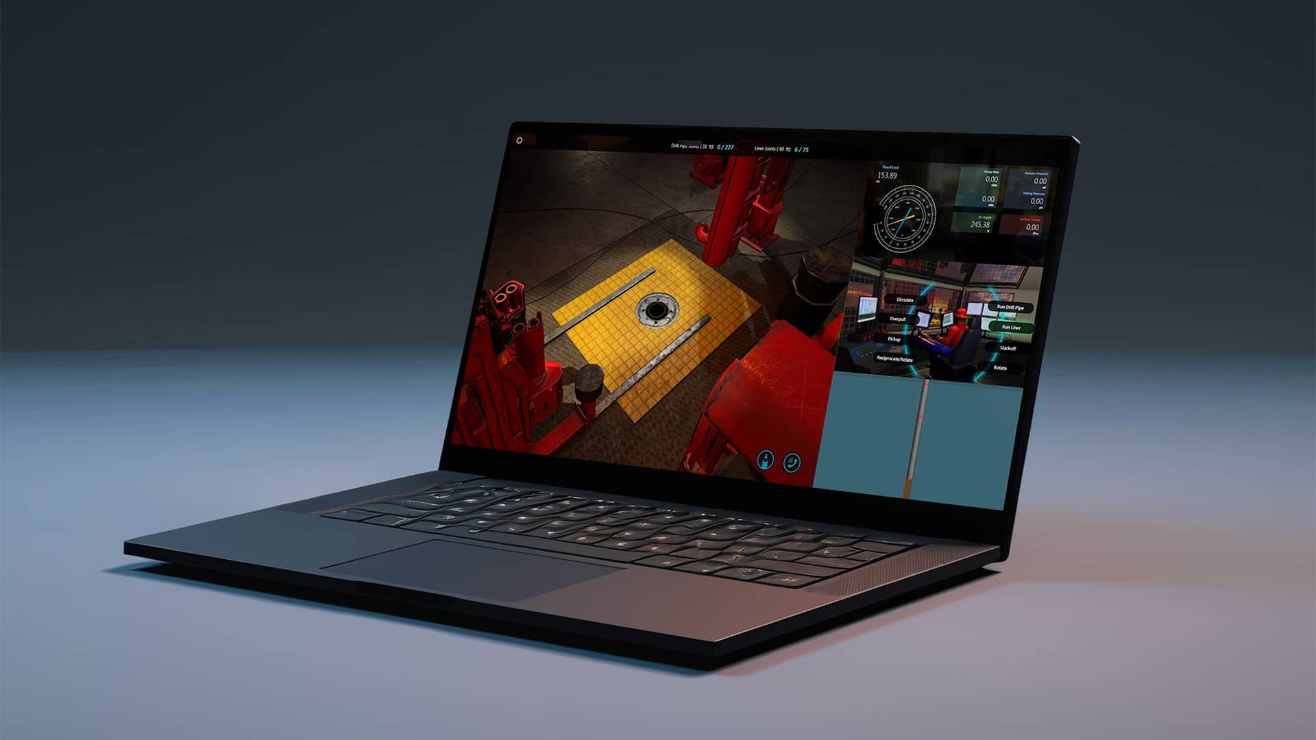
Adaptive layout approach
One significant challenge involved condensing an entire workstation's content into a single laptop without compromising context, clarity, or functionality. Since all views could have an equal amount of importance, depending on the user and task, there was a minimum level of complexity which could not be reduced ( Tesler's Law).
Laptop layout
Instead of trying to hide certain simulator views behind some type of navigation or control, we decided it was best to just merge all screens into one window since anything could be needed at any given moment depending on the user. However, everything needed to remain visible, understandable, and interactive in a much smaller space. With many tweak and adjustments I found a good balance.
To create some flexibility, I introduced controls that display upon hovering over a docked side view. These controls allow the view to either swap with the primary space or adjust its vertical stacking position.
 Condensed single screen
 Hover tile to reveal controls
 Replace main window with tile
VI.
Preparing the drilling scenario
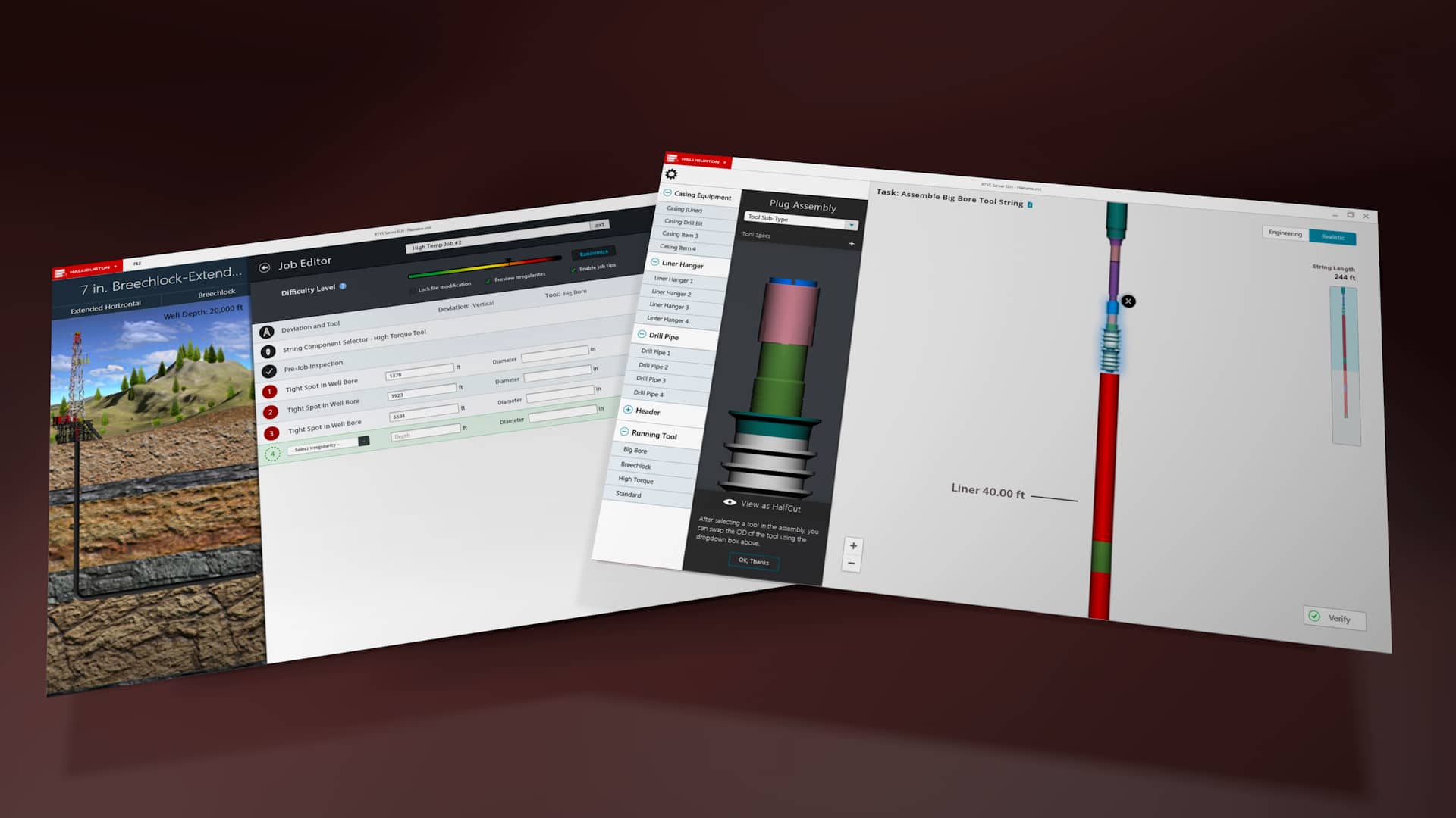
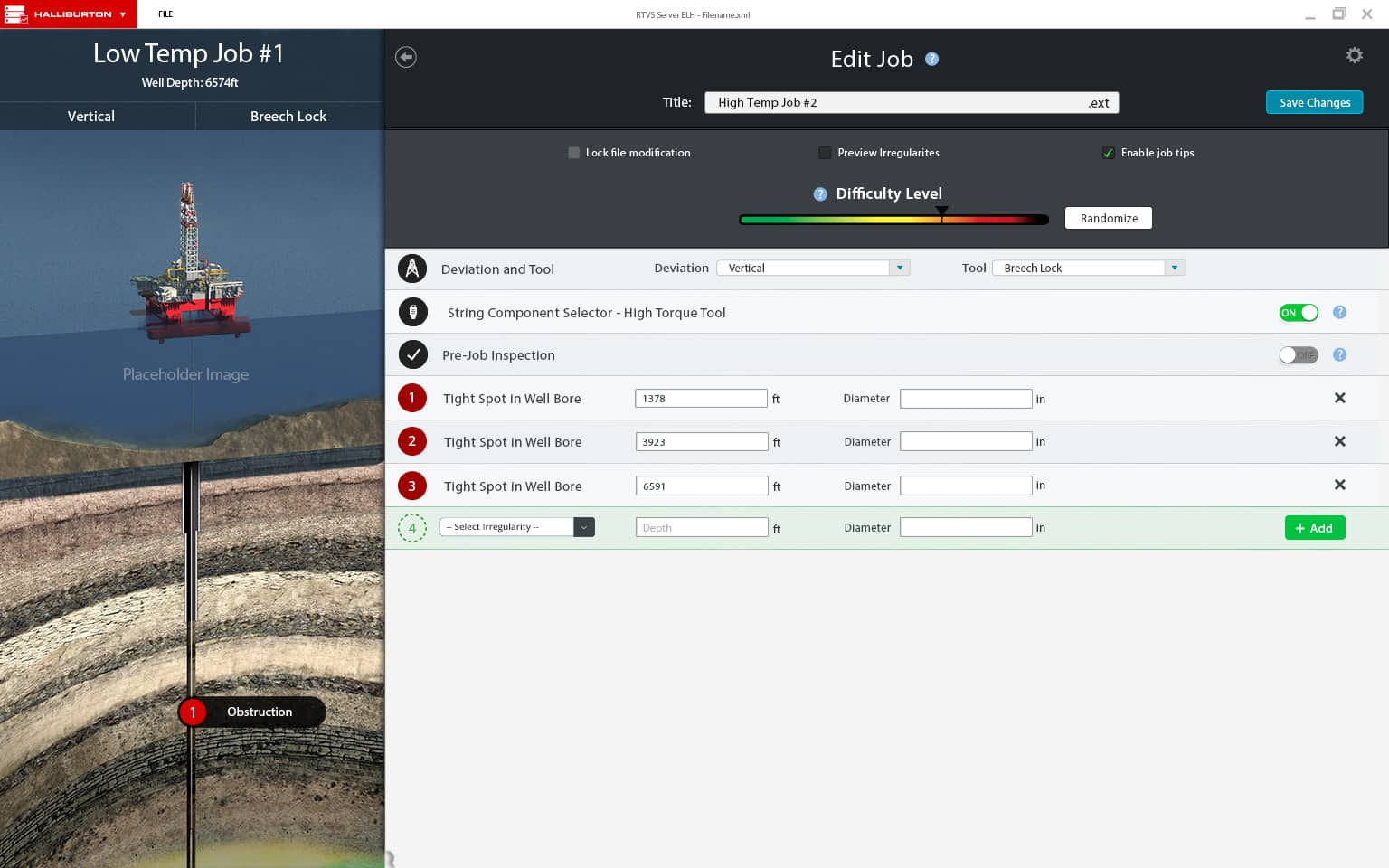
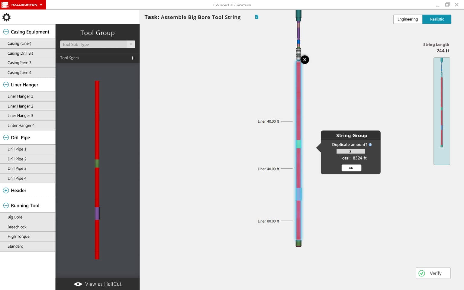
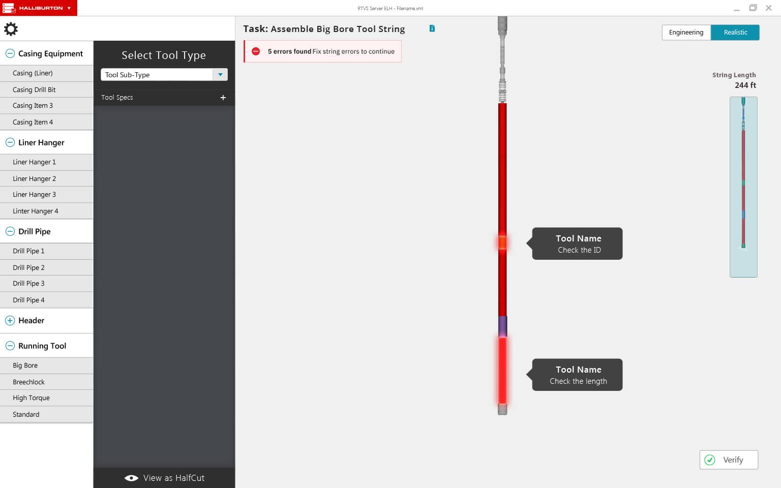
Before jumping into the simulation students, and teachers, first needed to go through some steps to configure and prepare the job to be run. This means we needed to preface the in-game experience with the Job Selector and String Component Selector (SCS).
Teachers needed to be able to create custom job scenarios with unique challenges and situations for the students to work on.
Students then needed to choose the job they needed to work on and actually assemble the entire drilling 'string.' With three different levels of difficultly, students would go piece-by-piece building the string needed down to exact specifications.
VII.
Pre-job design strategy
For these modules the goal was the use elements and assets we now had from the simulator to maintain some degree of immersion and game-like experience. Luckily, I had a variety of 3D assets available to use thanks to our 3D artist and engineering team. Now, I just needed to create two new modules which continue to reference the key focus areas above and support the main simulator module.
Job Picker overview
The Job Picker module would be the first screen seen when opening the application. Here students would be able to choose from some predefined job scenarios or choose a custom scenario, either created by them or their trainer. Custom jobs could have endless possibilities and be extremely challenging, allowing extra practice outside of course-defined scenarios.
Initial wireframes
I began with some initial sketches, trying to find a good layout that fit the main jobs list with its 3D preview. All were designed under the assumption that the final preview of the job was the most important element and thus should be first in content order.
 Too much empty space at top
 Better, but does image preview take priority?
 Messy, not enough defined structure
 Better, structure are layout still odd
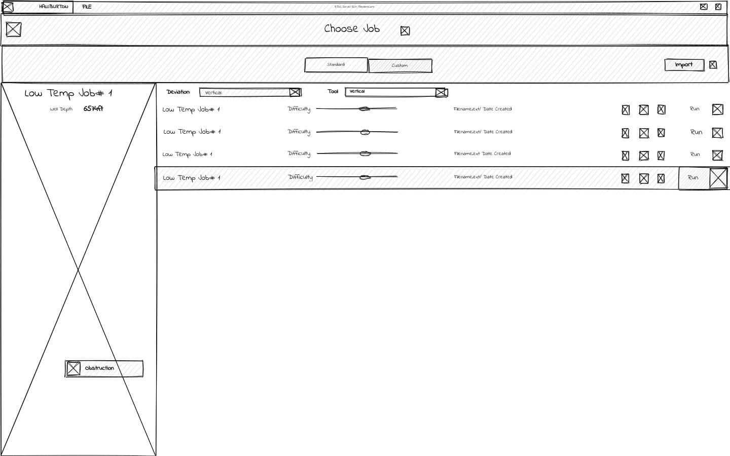
Solution delivered
After a couple sprints of iterating through some rough MVPs, we settled on this version. In the Job Editor the checkboxes were placed on top because they are settings more related to the file, but kept in the lower area because they affect the difficult. However, the overall layout still seemed odd. The preview is first in priority by being on the left, but all of the interactive elements which affect it were on the far right - creating long visual paths.
 Choose job - standard or custom
 Create or edit custom jobs
 Still has long visual path
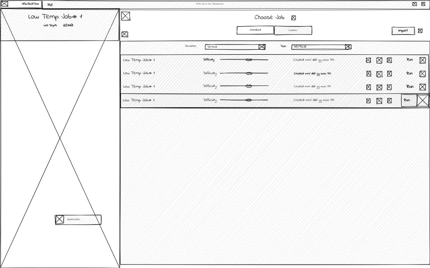
Reverse content priority
By reversing the entire layout the list of jobs and job parameters take priority, along with the main title in the top left. This also shortens the visual path between interactive elements and the reference image that will change with them.
Tucking the checkboxes neatly under the difficulty slider seemed to make more sense since the diffulty meter was the most imoportant element to the custom job.

Proposed solution
While this is ultimately not the version we went with, I believe this would have been the next iterative improvement. By not stacking so much of the content in the top-center, it reduces much of the empty space that didn't serve a strong purpose. The page name moves to top left alongside the back button (remove disconnect) since it should be the first thing seen. The reversed layout order also follows common design patterns of other applications (Jacob's Law).

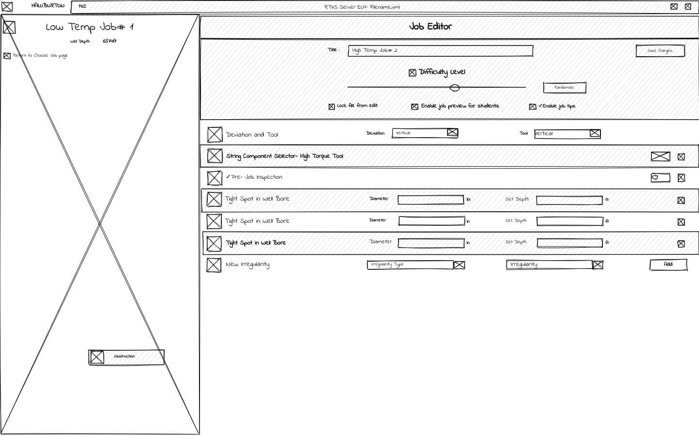
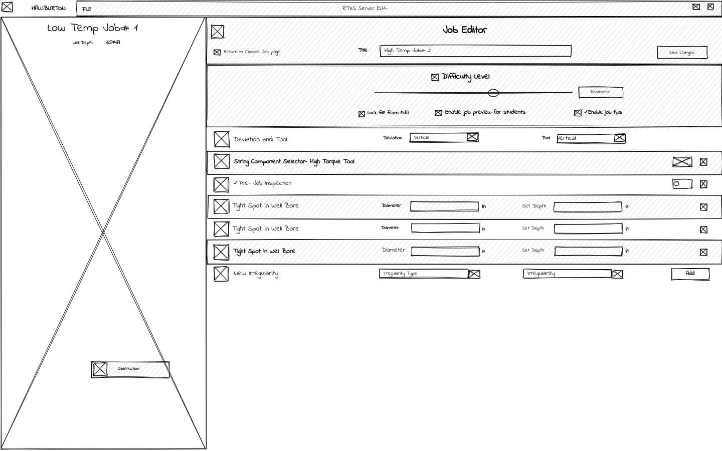
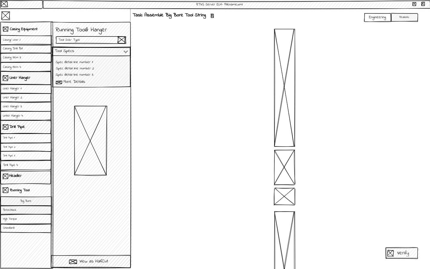
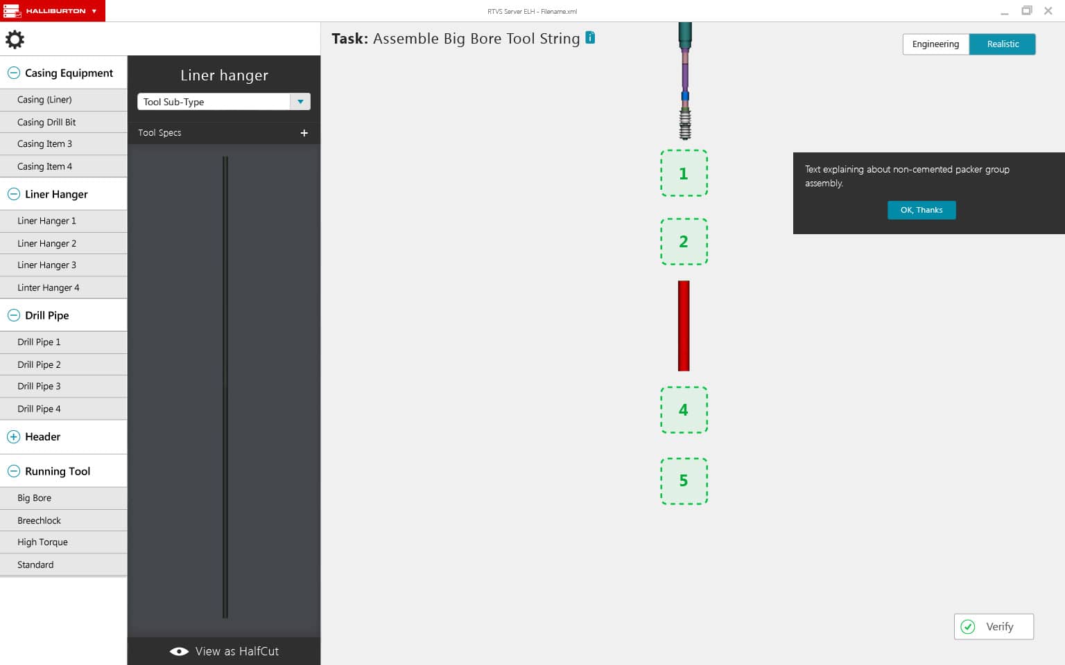
SCS overview
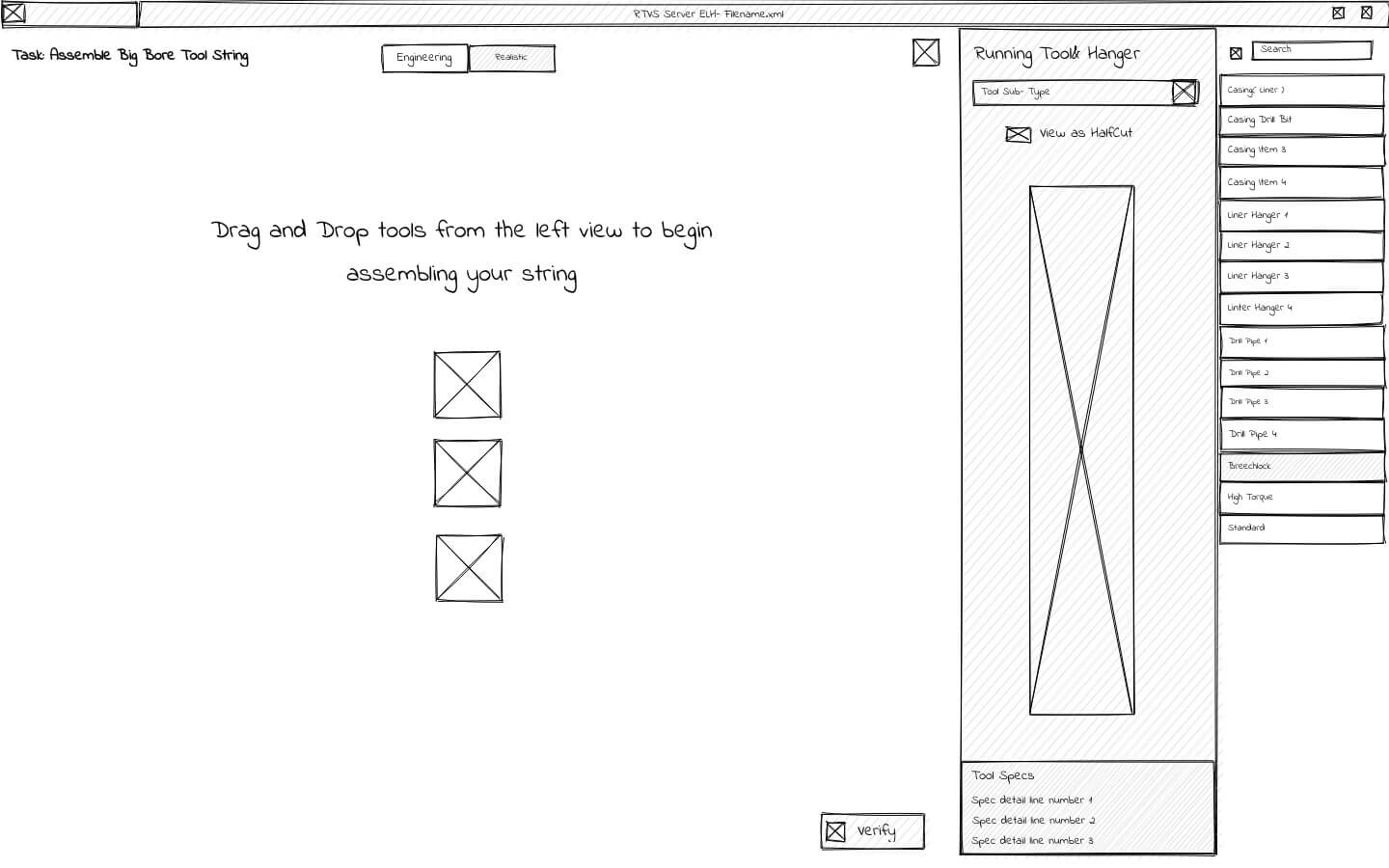
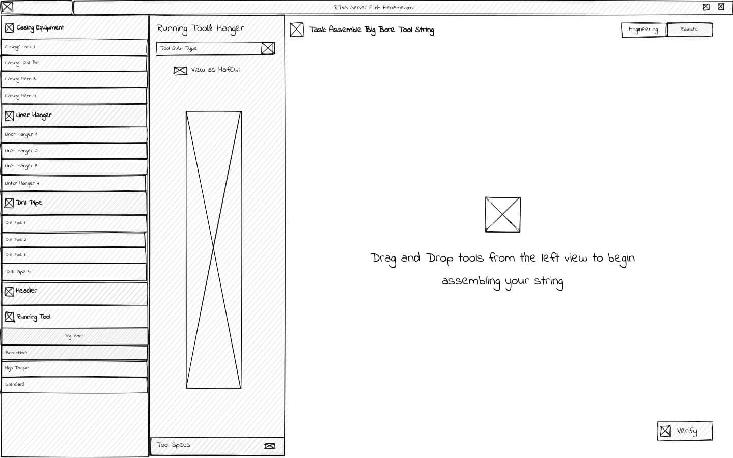
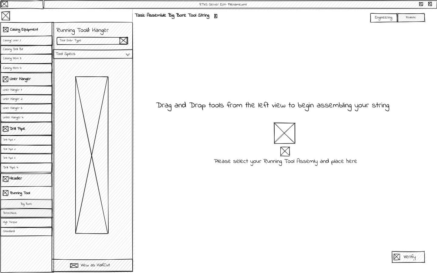
The final String Component Selector (SCS) module followed the Job Picker. Here students would assemble the drilling string they needed for the job selected piece-by-piece. The difficulty setting and options such as 'Enable job tips' would determine what kind of experience students would have.
Initial wireframes
After sketching out some ideas for what kinds of elements I needed, I ended up with two general layout options that could work. One used a structure similar to many canvas-based apps where the properties and objects being used are off to the right (or left and right), and the user works inward basically. The other had the objects and preview on the left, creating more of a step-by-step procedure, working left-to-right.
 Canvas focus working from the right
 Step-by-step approach left-to-right
 Step-by-step refined
 Seems that we have a winner
MVP direction
After some team discussion, we ultimately liked this direction. It seemed to just make more sense that assembling the string was more of a procedural process, rather than a freeflowing one. So, moving from finding the correct part, to previewing its specifications and documentation, to putting it in place in the correct order made the most sense.
Step-by-step approach
 Three steps moving left-to-right
String assembly in progress
Three steps moving left-to-right
String assembly in progress
Visual Design
After a few sprints of iterations, we landed on a visual design along these lines. Designed to visually match the Job Picker module, the SCS module made use of more simulator assets to make the assembly of the drilling string a very detailed and realistic process.

Active learning approach
The essence of 'active learning' lies in engaging students directly in the learning process to enhance their capacity to absorb and utilize knowledge. By offering a vividly authentic string-building process, complete with contextual explanations, helpful hints, and detailed error validations, we aimed to facilitate a deeper understanding of both their course material and the real-world tasks they would eventually undertake.

Solution delivery
The SCS module, employing 'active learning' strategies, aimed to invigorate the student experience beyond traditional passive methods. Upon completing a drilling string assembly, students plunged into the simulation for firsthand practice. Teachers, in turn, could access students' assembly results and make necessary adjustments in the Job Picker, fostering a responsive learning environment.

VII.
Conclusion & Impact
The Rig Simulator project, comprising three modules, was designed with a clear objective in mind: to enhance knowledge retention and comprehension of both onshore and offshore oil drilling processes. The ultimate aim was to bridge the gap between classroom education and real-life drilling experiences, which, in theory, it should accomplish. This was achieved through a combination of active learning techniques and a deep immersion into 3D simulation, offering a dynamic and engaging learning experience.
The initial feedback we received from the primary stakeholder and a handful of course instructors was highly encouraging, with immediate plans to incorporate the software into their curricula. While we would have appreciated the opportunity to conduct comprehensive user testing and research throughout the process and gather standard UX metrics (like CSAT, CES, time-on-task, etc.) for potential improvements, the response was overwhelmingly positive.
Interestingly, the project's success sparked interest across other internal departments within Halliburton. Several departments were already in queue, eager for a customized version to be developed for their respective areas, further testifying to the project's potential impact.
VIII.
Retrospective
Looking back on the rig simulator project, I had a few takeaways and reflections about the process and outcome.
Given this was my first real UX design role, I didn't know at the time, but it was one of the best, true agile processes I had been a part of. The balance and collaboration between design, engineering, and product was very effective, and the scrum ceremonies were done very well. This allowed us to iterate quickly, but with purpose and clarity.
The lack of research and analytics left a clear gap in developing user insights and benchmarking/testing solutions for improving measurable outcomes. Our stakeholder was happy but even measuring success with him would have been great.
Overall, I learned so much from this project and was really fortunate to get to work on such a dynamic, and challenging, product so early on in my career.